So, I can't believe I haven't posted something quite like this before! Oh well, better late than never.
Of course, one of the most recognizable icons of the Tower of Terror is its HTH logo. What fans might not realize at first glance, however, is that every iteration of the Tower has its own unique logo! Unfortunately, Disney's own marketing and merchandising often muddies the waters, releasing generic merch with mixed up logos to multiple parks. However, indeed, the intent seems to be that each version is acknowledged as unique, and gets an icon to match.
We'll start off with the first version: Florida's. This one, much like the version of the ride it represents, is distinctly gothic in style. The letters are in sharp, thin font and surrounded by dragons and a crown. Here it is on the ride's unique lobby tapestry.

A while back, I made a cleaned up version in plain black and white for reference:

 |
| Photo from minnieearcollectors.com, source |
The next logo to debut was supposed to be Paris', but it was "stolen" by DCA. Disney intended for Walt Disney Studios Paris to have a Tower of Terror from the start, fully designing the ride but acknowledging it needed to be built a bit after opening. Still, knowing where the ride would be and what it would look like, Disney included this logo as an Easter Egg on a building near where they knew the Tower would emerge. Unlike the gothic spikes of Florida, the newer design would feature a blocky art deco look. Subsequently, the logo was pared down, losing the spiky dragons and crown. Within the shield, a slightly different, thicker font was used for the lettering as well.
 |
| My 2016 photo of the DCA Tower logo banner, from likely my last-ever ride on the DCA Tower. |
 |
| A plain version for reference. |
 |
| 2017 photo by Pyrokenisis |
 |
| Disney-released promo image |
 |
| Black and white version to compare with the others |
It's arguably the most elaborate logo, with extra spikey font, metallic finishes, and a Great Gatsby-styled background evoking hotel gates.

Given the fact that two H’s could stand for either Hotel Hightower or Harrison Hightower, this logo appears again in modified form in Hightower’s office. The wallpaper of Harrison Hightower’s office has this design: Two H’s made out of swords, entwined in the tail of a dragon.
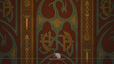 |
| re-creation of the wallpaper design found here |
...And now we're back to dragons, I see! Well, now that we've come full circle, I hope you've enjoyed this little tour of the different icons for each hotel. Have fun spotting the different ones!
Hey TZ,
ReplyDeleteJust wanted to say I love the blog and was delighted to see a new post! The Tower deserves this kind of analysis you provide, comparable to the analysis the HM and Pirates (equally deservedly) receive. There was that period in the '90s when "new" Disney rides—the Tower, Indiana Jones Adventure—were just as well themed and clever as the older rides. Now, alas, we get Mission Breakout.
As for the logos, I think my favorite is that 10th anniversary Paris logo. What an odd and interesting design—more art nouveau than art deco, I think?
Thanks again for all the good work!