Friday, May 26, 2017

Alternate Tower Spotlight: The Paris Tower of Terror, Part 1-- The History, Hotel Grounds, and Building Exterior

Ah, Paris--the city of Light.  Home to great culture, historic sites, art, food...and La Quatriéme Dimension.

"The Fourth Dimension?" one might ask.  "What does that have to do with anything on this blog? Or Paris, for that matter?"

Well, the French dub of a certain famous television show translated the title as "The Fourth Dimension", and for the next few posts, this blog's focus is going directly to: The Twilight Zone... Tower of Terror at Disneyland, Paris.

(Special thanks to Pyrokenesis of Tumblr for providing photos and information for this series!)

EDIT: As of January 2022, commenter Kurokori has provided a MASSIVE update full of photos, details and a few explanations of changes to the area around Paris' Tower.  Thank you so much!

From what I can tell, this is the official poster for the Paris version of the ride.
(Note: as of this writing, the Paris Tower of Terror is very much up and operating; however, I have chosen to use past tense in this post for grammatical ease and consistency with my other posts)

2022 Update: So far, Paris Tower has even survived the announcement and initial construction of the Paris version of Avengers Campus, with their version of Rock n Roller Coaster getting the unfortunate re-theme treatment instead.  In fact, Paris even got new drop profiles in the form of the New Dimension of Chills update.  However, projection shows do sometimes temporarily transform the Tower into Mission Breakout's themeing, using lights.

To begin with, the French version of the Tower had a surprisingly complicated history.  According to Martin Smith's documentary, when Disney opened up its second gate at its Paris property in 2002, it had always planned to include a new version of the Tower of Terror attraction at the park.  Disney even left a large chunk of land in the middle of the park cleared and prepped for the construction, and included at least one "HTH" logo on a coffee shop near the future Tower site.  However, budget prevented immediate construction on the attraction.

Meanwhile, back in the United States, Disney's California Adventure opened in 2001, and was experiencing its share of trouble.  One of the major guest complaints was the lack of attractions at the new park, and someone at Disney realized that they now had plans for a Hollywood themed attraction ready to go.  Thus, the plans for the new Tower design and construction moved to California, where the DCA Tower officially opened in 2004.

Paris' Tower, meanwhile, would not welcome guests until 2007, with the official opening celebration occurring in 2008.  The especially long soft-opening period has seemingly led to confusion over when the Paris Tower opened, with various blogs listing one year or the other.

Interestingly, this situation means that the DCA Tower was technically cloned from the Paris Tower, despite the Paris version opening 3 years later than DCA.  Paris was also the newest Tower to be constructed.

Walt Disney Studios Paris park map (credit)


Likely due to being actually planned for its home park, the Paris Tower had a much more detailed surrounding area.

To get to the hotel grounds from the park entrance, guests walked through the large Disney Studio 1 (a gigantic warehouse-like structure that I can best describe to U.S.-based fans as a concentrated indoor DCA 1.0, with lots of neon, exaggerated architecture, gift shops, and restaurants) and into Disney Brothers Plaza.  The Disney Brothers Plaza was the location of the famous "Partners" statue, which most fans likely recognize from the hub at Disneyland and the Magic Kingdom.  From there, guests basically just had to walk slightly forward and left to get to the hotel grounds.

It was very, very hard to miss the hotel grounds, given that they were marked by a gigantic Tower surrounded by what appeared to be a slice of 1930s Los Angeles.  Amusingly, the proximity to Disney Brothers Plaza meant that it was easily possible to get a picture of the iconic "Partners" with the Tower looming in the background... certainly a unique combination.

A small "Hollywood street" area surrounded the Tower, which featured forced-perspective art deco buildings and a few "quick bite" food locations.  The forced perspective fell apart to reveal studio sets in a manner similar to California Adventure's Hollywood Studios Backlot, but on a much smaller (and arguably better done) scale.

The area around the hotel building felt more "open" than its Californian counterpart; rather than being in a sort of pocket courtyard, there was a wide boulevard to the left of the Tower that continued onward towards the Paris versions of Rock n' Roller Coaster and Lights Motors Action.  The entrance to the Studio Tram Tour was on the right of the Tower grounds.  The Tower was in the middle of the park, rather than at the end of one road like Florida and California's Tower locations.

The Tower and its grounds, as seen from that wide road on the left.  The screen and stage in this photo were for the Star Wars projection show displayed on the Tower.  April 2017 photo by Pyrokenesis.
View of the grounds from the right side, through some trees.  April 2017, by Pyrokenesis

Like the other Towers of Terror, however, the Paris version had themed lampposts and a background music loop comprised of older music played through a ghostly-sounding filter.  From what I can find, this Exterior/Lobby music loop was the same as the version that played in Florida and California.

Themed lights and banners, April 2017 by Pyrokenesis
Unlike at DCA, the Paris fastpass stand was situated to the right of the Tower entrance, along the right side of the building.  Like its DCA counterpart, the fastpass machines were themed as suitcases.

Fastpass stand, April 2017 by Pyrokenesis
The display above the front of the fastpass stand featured digital displays rather than California's flip-number displays.  The sign, like almost all signs around Disneyland Paris, was in both English and French.  Interestingly, the sign above the entrance read "Next Stop: The Twilight Zone Tower of Terror" in English, but only "Prochain arrêt: La Quatriéme Dimension" (Next Stop: The Fourth Dimension/The Twilight Zone) in French.

Front side of the Fastpass stand, April 2017 by Pyrokenesis
A better view of the signs, April 2017 by Pyrokenesis
Fastpass machines, April 2017 by Pyrokenesis

The fastpass ticket design for the Tower was relatively plain, listing the name of the ride in a brown bar across the top of the ticket.  "The Twilight Zone Tower of Terror" was written very lightly in the logo font, almost like a watermark, along the length of the ticket.

A Paris Tower fastpass ticket.  April 2017 by Pyrokenesis
From what I can tell, Disneyland Paris fastpasses all followed the same design, having the name of the ride on a colored band on top of the ticket.  Also note that the times on Paris fastpasses used a 24-hour clock rather than a 12-hour one.

2022 Update: According to Kurokori, as of 2022 fastpasses are no longer in use at Disneyland Paris, thus making the fastpass ticket above and possibly the fastpass stand defunct unless repurposed.

To the left of the Tower entrance, in between the Tower and the road leading to Rock n' Roller Coaster, was a rose garden, labeled as such with a sign in Banhof Regular font.

April 2017 photo by Pyrokenesis
Statue in the garden, April 2017 by Pyrokenesis
Broken fountain in the garden, April 2017 by Pyrokenesis
Readers might notice that the rose garden sign matched the style of the "pool" and "tennis court" signs at the DCA version of the attraction.  While I don't have any evidence concerning the tennis court sign, Pyrokenesis was able to confirm that the "pool" sign was located in the fastpass garden rather than the Tower grounds at Paris.

2022 Update: As of the (still in progress, as of this writing) construction of Avengers Campus, it appears the rose garden might be gone, in favor of a rerouted walkway into the new land.  The following screenshots were provided by Kurokori, and show the difference before and after construction began.
Before Avengers Campus construction

Jauary 2022, with Avengers Campus construction

Just behind the rose garden was another unique feature of the Paris Tower: bathrooms!

Unique and convenient.  April 2017 photo by Pyrokenesis
Like DCA, the Paris Tower had a dried-out art deco fountain with a sign that switched between "The Hollywood Tower Hotel" and "The Twilight Zone Tower of Terror."

April 2017 by Pyrokenesis
Unlike the Californian version, the fountain didn't have anything planted in the two planter bowls next to the sign.  Indeed, the landscaping foliage was a significant difference between the DCA and Paris Towers.  California's featured lots of palm trees and Californian-style landscaping, while Paris used plants more suited to the more varied and cold French weather, where snow is a very real possibility in winter.

I personally rather like the Parisian landscaping; while it is less accurate to the in-story Hollywood setting of the ride, its sparser look in winter (especially when paired with snow) really captures a "haunted" feeling for the setting.

Parisian Landscaping.  April 2017, Pyrokenesis
Regarding that fountain, another difference from the California version involved the bronze "HTH" plaques.  In Paris, the plaques were on the columns bordering the fountain, as circled in this picture sent to me by Pyrokenesis:


Detail of plaque, April 2017 by Pyrokenesis
In California, the plaques were on the columns bordering the entrance to the queue, and the fountain columns were blank, as seen here:

DCA photo showing lack of plaques
The plaque in the detail picture also looks shinier/newer than its Californian counterparts.

2022 Update: Here is Kurokori's photo showing Paris' fountain with the plaques
Kurokori, 2022

As for the building itself, the Paris Tower featured the same pueblo deco design as DCA, with one very quickly identifiable difference.  Under the "T" shape at the top of the building, Paris had round architectural details that DCA lacked.

I tend to informally refer to these details as "round things," but maybe "fins" would be the more appropriate term?
It's actually a mystery why DCA's building didn't have these fins, as they appeared in all official artwork and the pre-show video for both the DCA and Paris versions of the ride.

2022 Update: Budget.  The answer to the "mystery" was budget.  I cannot find the original source at the moment, but I recall an interview with an imagineer that implied the existence of DCA Tower was something of a budgeting miracle, with them having to shave off dollars on every tiny place they could to make it fit in DCA.  The California Adventure team did everything it could to keep costs down, and that included cutting architectural details.  Guardians of the Galaxy's paint scheme even revealed that multiple dimensional-looking elements in DCA's façade were actually painted illusions, while Paris' details are all apparently real.

Despite having the same appearances, the two buildings were also constructed out of different materials.  Paris' was made out of concrete, while California's had steel beam construction.

These Towers also had slightly different paint schemes.  In addition to apparent variations in the color tones around the exterior (although these could be tricks of the light/weather/camera), Paris' Tower had one additional paint detail that DCA's lacked.  This detail was only visible from the air.

Screenshots from Google Earth.  Left is Paris, Right is DCA
In Paris, the roof of the building in front of the drop shaft openings was painted to look like the floor of the broken-off parts of the hotel, while in California the roof was painted flat exterior brown.  It's a nice detail in Paris that was likely to go unnoticed by guests, due to this section of roof only being visible for a split second as the elevator dropped.

2022 update: Based on further photos, it really does appear that the buildings were painted with different color schemes.  The paint on the signs were also slightly different, as seen in these photos provided by Kurokori:
DCA sign

Paris sign, Kurokori 2022

Fun fact, those ridges above the sign are DEFINITELY painted illusions in California (revealed via the Mission Breakout paint scheme), but presumably real in Paris.

Oh, and those aren't the only different details.  In general, Paris has a different, much more detailed burn area than the DCA version.  Whereas the DCA version was done entirely in paint, Paris has three-dimensional sculpted details to add realism.

Overall view of the burned area, Kurokori 2022

Closeup of the elevator doors.  Note the extreme detail on the doors, burnt floor, and ripping "wallpaper" in the hallway.  Kurokori, 2022

Another photo showing the detail in the destroyed zone.  Note the realistic brick texture as well as raised "flakes" that help sell the illusion of a destroyed building.  Kurokori, 2022

Another view of the sign.  I love the subtle paint variations that simulate smoke damage to the right of the sign--yet another finer detail on Paris' paint scheme.  Also, this photo also helps show that the ridges above the sign are real, not illusions like DCA's.  Note how the change in angle between this photo and the bit of the ridges you can see in the previous photo indicates that they really are three dimensional.  Kurokori, 2022

Furthermore, there was yet another detail difference between DCA and Paris that Kurokori mentioned, which oddly enough I'd never heard mentioned anywhere else in all this time.  In an unusual twist, DCA had an extra detail that Paris did NOT.  DCA had one balcony suite door open on the Bug's Land side, while on Paris the balcony suites all have their doors closed.

Closed balcony doors in Paris.  Note once again the sculpted details and elaborate paint work.  Kurokori 2022

The equivalent side on DCA, with open door detail, unknown date and photographer


Detail of above pointing out open doors.  Note the different burn details on DCA.


The back side of the Tower was mostly the same as California's, with the exception of having different backstage configurations and for having the back side of the building visible from within the park due to the central location.

At night, the Paris Tower lit up with the same dark blue and purple color scheme that DCA also used.  The sign flickered in the same manner as California's Tower as well, with the "W" flickering, the "O" usually dark, and other flicker sequences happening at rare intervals.  Unlike DCA, someone actually managed to film one of the different sequences (albeit from a non-optimal angle), as seen in this instagram clip (not my video)

Halloween 2016 picture by Pyrokenesis
Starting in January 2017, the nighttime Tower also became the host of the “Star Wars: La Celebration Galactique” projection show, as seen in this video from YouTube:


2022 Update: The Tower has since become the platform for numerous projection shows at Disneyland Paris, including some that half-amusingly half-alarmingly transform it into Mission Breakout for Marvel themed shows.

Kurokori also informed me that, once again, DCA unusually received a detail that Paris did not, albeit one only visible at night.  Paris lacks the spooky flickering lights in the topmost windows of the Tower, and also lacked nighttime lighting in several windows by the standby queue, as will be shown in that post.
Nighttime photo taken from the Swiss Family Robinson treehouse.  Note the lack of lights in the windows.  Kurokori, 2022

Overall night exterior.  Kurokori, 2022

For comparison, here's my 2016 photo of DCA from a similar angle:

DCA night exterior, photo by me.  Also note how one of the suites in the lower right seems to be lit in DCA, but I cannot tell if it is also lit in the Paris version.


It seems fitting that our tour of the hotel grounds end where it would if we were actually at Disneyland Paris: the entrance to the queue.

The front gates had the same general appearance as their DCA counterparts, albeit with digital rather than flip-number displays.  However, rather than having planters on either side of the entrance, there were pay phones to the left of the entrance, and some sort of utility cabinet to the right.  From there, guests entered either the left side of the gate for standby, or the right for fastpass.

Photo April 2017 by Pyrokenesis
This view shows the right side of the entrance.  April 2017, by Pyrokenesis
Enough hanging around outside, let's get in the queue!

2022 Update:  Hey, wait!  While we're here, why not enjoy some more photos from Kurokori?
Overall exterior, with stage.  Kurokori, 2022


According to Kurokori, it seemed like repainting was in progress during his trip.  I wonder how much of Paris' paint variation is due to the weather.

And finally, a view of the Tower with the Walt Disney Studios Paris water tower.  Kurokori, 2022

Friday, May 5, 2017

The Tower of Terror at Disney's California Adventure: A Complete Fan-made Walkthrough (Tower's 13th Anniversary Edition)

Photo by my dad, May 2016

May 5th, 2017 is the 13th anniversary of the official opening of the Tower of Terror at Disney's California Adventure-- an important anniversary for a ride so fixated on the number 13.

(The ride was so dedicated to "13 is unlucky" that all clocks visible to guests were set to 8:05, because 8+5=13.)

Most unfortunately, of course, Disney decided to replace the California Tower with a re-theme dedicated to Guardians of the Galaxy, meaning that the Tower didn't make it to this milestone.

However, at last, after months of hard work, I can present this masterpost, containing links to every chapter of my complete walkthrough of the ride, from the exterior grounds to the exit gift shop.  Each post has been reviewed and updated (where necessary) in an attempt to present the clearest and most complete presentation possible.  One might not be able to experience the ride in person, but I hope this combination of text, photos, audio, and video at least gives an idea of what this excellently crafted attraction was like.

Main Walkthrough:

The Hotel Grounds
Music from Regions Beyond: The Exterior and Lobby BGM Loop
The Hotel Exterior, Architecture, and Exterior Queue
The Hotel Exterior at Night, A Glitch in the Matrix, and the Paper Bag of Shame
The Lobby
The Library and Pre-Show
The Boiler Room Part 1: The Hallway and Lower Queue
The Boiler Room Part 2: The Upper Queue
The Loading Area and Boarding Sequence
The Ride!
The Exit Corridors and Gift Shop

Bonus Feature Posts:
Recommended Videos
Tournament of Roses Parade float
Construction and Opening Ceremony
Early Promotional Material
Fastpass Machine Detail Photos
The Latest in Bellhop Fashion: Cast Member Uniforms
Special Feature: An Account of the 13th Hour Closing Party


I would also like to thank all of you who have helped me with this project, including (in no particular order):

Dusty Sage, Commander Corn, and Wandering Optimist/Optimist_Zero of Micechat
Mrbellcaptain, land-of-manors-and-beans, knockturnalliewitchstew, the-magic-sets-us-all-aglow, didyouknowmagic, pyrokenesis, and disneylandguru of Tumblr
And those who contributed greatly to this blog but did not wish to be credited!

(I hope that's everyone!  If I forgot to include you in the credits, just let me know!)


Tuesday, May 2, 2017

Walkthrough Part 8: The Exit Corridors and Gift Shop

Although the ride ended when your elevator pulled back into the station, the actual guest experience at the Tower of Terror certainly didn't end there.

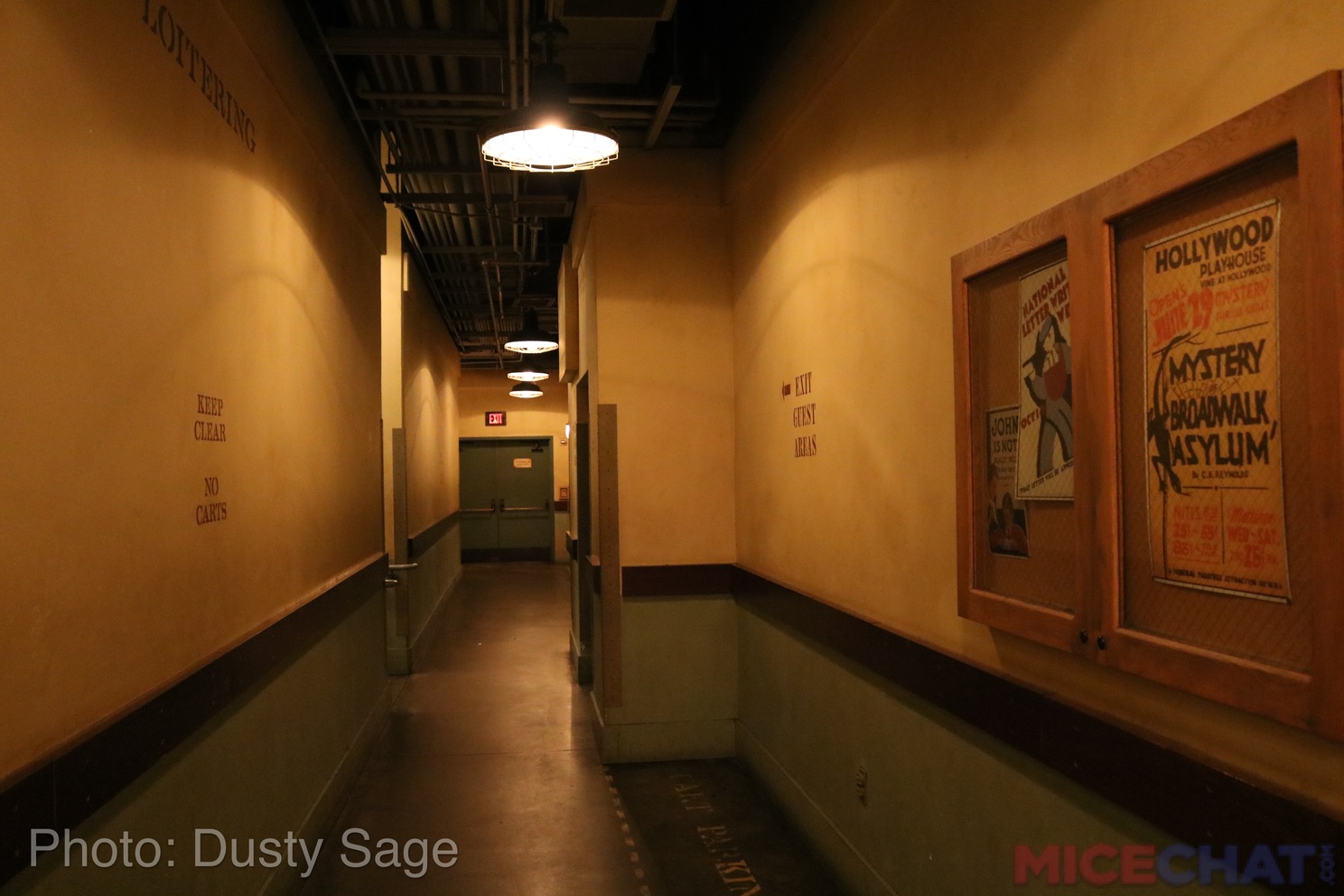
Upon leaving the ride car, guests entered the exit corridors.  Stenciled signs reading "Exit Guest Areas" sent guests in the right direction.

The angle of the arrow in this sign makes me think that this was directing guests down the stairs from one of the upper elevators.  Photo by Dusty Sage of Micechat.  Original Article

There were actually two sections of exit corridors: the main one, and a small hallway dedicated only to the farthest-left lower-level elevator.  All of the details were in the main one; the small hallway had nothing special about it other than the fact that it only served one ride car.

All of the exit corridors had two-tone walls, with a sort of dull beige-yellow for the upper section, a faded green for the lower section, and a dark wood stripe separating the two colors.  The floors were plain concrete.  In the main exit corridors, the occasional floor section was marked off in yellow with stenciled letters reading "Cart Parking" in unknown font.  Some of these "cart parking" areas had benches in them.

Unique background music played in the exit areas: a haunting, dramatic tune that wouldn't be out of place in a Twilight Zone episode.  Here is the source audio, posted by Dlp Sounds on YouTube:


The main exit corridors naturally had upper and lower levels to accommodate the upper and lower elevators.  However, rather than having completely split levels like the queue, there were individual staircases going down from each upper-level elevator to the lower exit floor.  In between the middle and right elevators there was a gap, which housed a wide hallway through which the middle and right lower-level elevators exited.  For ease of writing, I'll call this the "double staircase."  The left upper-level elevator exited down a single staircase farther down the exit area.

A photo of the main exit corridors, taken just past the "double staircase" and heading toward the gift shop.  Photo by Dusty Sage of Micechat.  Original Article
The "double staircase." Photo by Mrbellcaptain
Close-up of the where guests in the lower-level elevators exited under the double staircase.  This view, and the previous photo of the stairs, is looking back toward the elevators.  Photo by Mrbellcaptain.
The most interesting part of the double staircase area, however, was the fact that it housed one of the more hidden Easter eggs in the Tower.

The sections directly under the staircases were enclosed with black metal grating, as can be seen in the previous photos.  Behind the grating were various crates and junk, indicating that the place was being used as a storage area.

Various props behind the grating.  Photo by Mrbellcaptain
More assorted junk.  Photo by Dusty Sage of Micechat.  Original Article
If one looked closely at the storage area under the middle elevator's staircase, however, one saw that it wasn't just crates and old furniture stored under the stairs!

May 2016 photo
Yes, some feet and shoes sticking out from behind a crate indicated that someone had stashed a body under the stairs!  Sometimes the shoes were down like in the photo above, other times they were tilted upward (more like they were on someone's feet).  The dead feet were relatively difficult to see in person; the above photo was taken with a flash and it took several tries to get one where the feet were clearly visible.  It was very dark under that part of the stairs, and most people would be rushing by to get to the exit.  This was an Easter egg you really had to look for--probably with a flashlight.

This referenced the Twilight Zone episode "Dead Man's Shoes," in which a homeless man takes the shoes off a corpse in an alley, only to find himself becoming the dead man.

Closer view of the dead man's shoes.  Photo by Dusty Sage of Micechat.  Original Article
As guests came down the stairs or out of the middle of the double staircase, they saw a wall with a stenciled sign directing them to the left, with a plain bench in front of it.

Photo by Mrbellcaptain

If guests looked to the right from here, they saw a hallway with a sign above it, reading
Kitchen Scullery
All Others
Keep Out
in Rubens font.  Oddly Rubens font was only used here and for the "Directory" sign in the lobby.  The other stenciled signs around the exits and boiler room were in a different unidentified font.  Apparently down the "Kitchen Scullery" hallway was a backstage exit, but obviously guests were not meant to go that way.

Looking back toward the right side from just past the double staircase.  That's the plain bench directly across from the staircases.  Photo by Mrbellcaptain
Kitchen Scullery sign.  Photo by Dusty Sage of Micechat.  Original Article
As guests walked in the direction indicated by the exit signs (that is, away from the "Kitchen Scullery" sign), they came across two enclosed announcement boards on the wall to their right.

The first board.  Click photo to see a larger version for the details.  Flash photo taken May 2016.
The second board, which was a short way down the hall from the first.  Once again, click for larger version.  Flash photo taken May 2016.
From what I can tell, none of these posters contained any specific Easter eggs or Twilight Zone references.  They did, however, keep with the vaguely creepy atmosphere, with advertisements for plays titled "Mystery Boardwalk Asylum" and "Devil's Disciple".  The visuals for the "John is not dull" and the "Industrial Arts" posters were vaguely unsettling as well.

In between these two message boards was a green door.  This led to "backstage" employees-only areas.

Photo by Mrbellcaptain
Directly across from this green door was the stairwell down from the far-left upper-level elevator.

Photo looking backwards towards the "Kitchen Scullery" sign, showing the general arrangement of the exit halls thus far.  The "Devil's Disciple" message board was to the left of the photographer in this picture.  Photo by Mrbellcaptain
A view up the far-left elevator's stairs, featuring a bellhop.  Photo by Mrbellcaptain
Walking past the stairs, door, and second message board, one arrived at the end of the hall, which had an emergency exit.

Photo by Mrbellcaptain
During the first year or so of the Tower's existence, a cast member stood by the emergency exit doors and handed stickers reading "I took the dare!" to young riders.  The slogan on the sticker referenced the "Drop in if you dare!" tagline used for advertisements in the Tower's early years.

For the normal exit, guests made a sharp left turn to go through some ornately carved wooden doors into the photo viewing room.

Going from the exit corridors to the photo room.  Photo by Mrbellcaptain
Fancy carvings on the wood doors.  Note how the carvings match the wood carvings back in the lobby.  Photo by Mrbellcaptain
Art deco detailing above the entrance to the photo room. Note the second entrance from the lower-left elevator.  Photo by Mrbellcaptain
The sudden shift from the minimalism of the exit corridors to the ornate stylings and tile floors of the photo area made it clear that guests were no longer in the fictional "backstage" of the hotel and instead had returned to the main areas.

The photo area was an oddly-shaped room (it was vaguely hexagonal) with a dark tile floor and a geometric light in the ceiling.  Angled along one wall was a row of six television screens, displaying the on-ride photos taken the first time the elevators dropped from the highest point in the ride (that is, the part with the exterior view over Disneyland).  Below the screens were three display cases, each containing Twilight Zone Easter eggs.

May 2016 photo.  I was standing approximately in front of the entrance from the small exit corridor.
The farthest-right display case had a metal "HTH" logo, an art deco statue of a woman and a dog, a display of electric razors, and a red toy telephone.

May 2016
The card by the telephone read "Perfect for the children's room and those late night calls from grandma."  It was printed in Banhof Regular font.

Both the razors and the telephone referenced Twilight Zone episodes.  The telephone and its description card referenced "Long Distance Call," in which a young boy held conversations with his dead grandmother via a toy telephone.  The razors referenced "A Thing About Machines," about a man named Finchley who poorly handled appliances and eventually had the machines in his house (including his electric razor) turn against him.

"A Thing About Machines" had a second reference in this section of the Tower, specifically in the middle display case.

May 2016
The middle display case was larger than the other two, and had the text "Modern Wonders: Experience New Dimensions of Sight and Sound" painted across the top of the glass in an unidentified art deco font.  This case held a collection of radios and typewriters.

One typewriter in the center of the display had paper threaded through it, which read:
"GET OUT OF HERE FINCHLEY"

A card in front of the typewriter read "Practically writes by itself."  This was the second reference to "A Thing About Machines," where the main character's typewriter angrily typed "GET OUT OF HERE FINCHLEY" at him.

The typewriter.  May 2016
The card on the radio read "Static-free reception.  You'll be surprised at what you hear."(1)  This referenced the Twilight Zone episode "Static" where a man who yearned for the past heard old radio programs on his radio while others heard static.  The radio in the boiler room may or may not have also referenced "Static."

Disney's own official listing of the "Static" Easter egg(s?) was quite confusing.  It specified that an antique radio from "Static" tuned in to programs from the past, but the boiler room radio had the voice of the little girl from "Little Girl Lost" and this radio in the display case was silent!

The left side display case had a selection of antique cameras and an HTH logo.

May 2016
One camera in particular had a card in front of it, reading "A most unusual camera" in Bahnof Regular font.  This camera was a replica of the one from the episode "A Most Unusual Camera," where the device in question created photos of future events.

Close-up of the camera. May 2016

Other cameras in that display included what appear to be Kodak Beau Brownie cameras and a Kodak Bantam Special camera (or similar models).

Across from the screens and display cases, along the back wall in between the openings from the two exit corridors, was another reference to The Twilight Zone.

In the back of the room was a large display window, although it always had a thick red curtain drawn across the inside and never actually displayed anything (as far as I know).  However, painted across the top of of the window was an advertisement: "Willoughby Travel."

May 2016
This referenced "A Stop at Willoughby."  I'll avoid spoiling the episode's ending, but I'll just say I certainly wouldn't want to take a vacation from "Willougby Travel" anytime soon!

In between the small exit corridor's end and the gateway to the gift shop was a lighted poster that constituted yet another reference to the TV show.

The location of the poster.  That's the small exit corridor's opening on the left, and of course the gift shop entrance to the right.  Photo taken May 2016
The poster itself.  May 2016
It read:
"The Tip-Top Clup proudly presents 
Anthony Fremont and his Orchestra
Now Appearing at the Top of the Tower"

This referenced the episode "It's a Good Life."  In that episode, Anthony Fremont was a six-year-old with superpowers that allowed him to malevolently control his entire hometown.  In the episode, he hated it when people sang--maybe that's why he conducted an orchestra at the Tower?

"It's a Good Life" also lent its opening narration to the Tower's pre-show video.

From here, guests made their way into the gift shop.

Exit to the gift shop.  May 2016
Tower Hotel Gifts was a fairly standard (albeit properly themed) post-ride retail space anchored by two desks: the checkout desk and the photo purchase desk.

The checkout desk was visible right from the photo viewing area entrance, and was characterized by a large Hollywood Tower Hotel mural flanked by Egyptian-styled statues.

The checkout desk and mural.  May 2016
Detail of Egyptian-styled statue.  Photo by Mrbellcaptain
Those of you looking closely might notice that the mural depicted the Tower with the round fins on the side that differentiated the California Tower from the Paris version.  What? Another official artwork accidentally depicting the Paris Tower? you might ask.  However, I think I have figured out the root of this apparent mistake.

In Martin Smith's DCA/Paris Tower documentary, Smith explained that this version of the Tower was originally designed for Paris, but then Paris' construction got delayed and Disney decided to copy the plans for California Adventure to help out the floundering new park.  This meant that the entire design/artwork, including those round fins, were already in place for the DCA version.  For some reason, the fins were never put on the California Tower, even though they were supposed to be there (to the point of being in the pre-show video and the official artwork) and not something added for Paris.  Of course, this just brings up the question of why the DCA Tower lacked fins, and I have no answer for that.

A view of most of the gift shop, showing the two desks.  Photo by Mrbellcaptain
The photo desk was at a right angle to the checkout desk, and was situated along the building's front wall.  A lighted sign above it read "Picture if you will..." in Banhof Regular font.  This was, of course, a reference to Rod Serling's monologues in the television show.  Here, guests could purchase their on-ride photos.

The photo desk, by Mrbellcaptain
Old-looking photographs and vintage cameras on the wall behind the desk.  Photo by Mrbellcaptain
Photo purchase prices as of late 2016.  Photo by Mrbellcaptain
According to Optimist_Zero/Wandering Optimist of Micechat, photo envelopes circa 2004 had the original exterior gate mural on them.

To the left of the photo desk was a refrigerator with sodas, with four photos above it.

Photo by Mrbellcaptain
The photos above the refrigerator depicted the characters from the pre-show video.

Photo by Mrbellcaptain
The queue area for the photo desk, with the photos and refrigerator behind it (and a good view of the carpet).  Photo by Mrbellcaptain
In terms of merchandise, what you'd find in the shop varied significantly depending on when you were there.  In the years just after opening, there was a LOT of Tower of Terror-specific merchandise, including merchandise that specifically depicted the California version (i.e. T-shirts and name tags that showed the actual facade of the ride, or things like the mirror scene that were at the time unique to DCA).

After a couple years, however, a lot of specific merchandise disappeared.  Tower-themed merchandise that remained tended to be generically "Hollywood Tower Hotel" branded, presumably so Disney didn't have to bother making unique items for the different iterations of the ride in Florida, California, and Paris.  At that point, a significant amount of shop space inexplicably became dedicated to Nightmare Before Christmas merchandise, despite that film having no connections to the Tower whatsoever.

When Disney announced the Tower's closure, unique Tower merchandise returned, this time themed around the "Final Check-out."  However, large amounts of shelf space remained dedicated to Nightmare Before Christmas, along with a little bit of Marvel merchandise.

"Final Check-out" merchandise, December 2016.  Photo by Mrbellcaptain
Lots of Jack Skellington merchandise, December 2016.  Photo by Mrbellcaptain
When the Tower first opened, this rotating pin rack held personalized name tags that showed the DCA Tower facade.  Photo by Mrbellcaptain
"Hollywood Tower Hotel" branded merchandise on a display table near the shop's exit.  December 2016 photo by Mrbellcaptain
I cannot recall what, if any, music played in the gift shop.  I posit that it either had no music, or used the same loop as the lobby and exterior hotel grounds.

Once ready to leave the shop, guests left through metal-and-glass doors that had geometric designs on them.

Could that eye design be a reference to CBS, The Twilight Zone's original network?  Photo by Mrbellcaptain
The gift shop's exit/exterior entrance had a lighted sign reading "Tower Hotel Gifts" in Banhof regular font.  The exit was set under an overhang with a beautiful chandelier.

Photo by Mrbellcaptain
The ornate chandelier and an overall look at the overhang.  May 2016.
If guests turned left after exiting the gift shop, they entered the small rest area with benches I mentioned in my post about the Tower exterior.  Sandwiched in between the exterior standby queue and the building, the area had a few plain benches and two shop display windows.

The window closer to the gift shop door was an actual display window featuring merchandise from the gift shop.

The shop display window in December 2016.  Note that ALL the merchandise in the display is Nightmare Before Christmas, despite this being in the middle of the "Final Check-Out" promotion!  Photo by Mrbellcaptain
The other display window, rather than featuring actual merchandise, displayed a fancy dress and various vintage-looking luxury goods.  This window appears to have been meant to approximate the kind of luxury goods the shop would offer in-story, as opposed to the theme park souvenirs available in reality.

May 2016
The items in this display got shuffled around a bit throughout the years, and there were also seasonal variants of the display (such as Halloween and Christmas versions).

Streamers in the window for a Christmas display, December 2016.  Note how the dress is in a slightly different place.  Photo by Mrbellcaptain
The photo is blurry, but you can tell that gift boxes were added to the display, too.  December 2016, Photo by Mrbellcaptain
At this point, guests returned to the hotel grounds.  From there, they were free to exit to the rest of California Adventure, sit around and enjoy the atmosphere... or re-join the queue for another trip through the Tower!

***
Thus ends our main walkthrough of the Tower of Terror at Disney's California Adventure.  However, this is FAR from my last post on the subject!  After all, there's still other aspects of the ride to cover, including its special Halloween mode, so stay tuned!

***
(1) Many thanks to Mrbellcaptain for figuring out what this card said!  I couldn't find a clear photo of the card, and it took much work to find what it was.