Sunday, December 30, 2018

The Sweet, Soothing Blue of the Supernatural: Color as a Storytelling Tool in the Tower of Terror

A big reason that Tower of Terror, especially the original in Florida, remains my favorite Disney ride is because of the (apparently) extreme amount of care that went into making such a detailed attraction.  This extends even to the careful use of color throughout the experience.  The color palette throughout the ride changes to accompany shifts in tone as well as the level of supernatural apparent in the setting.  This is most pronounced in the original Twilight Zone Tower of Terror.


The daytime outer color palette of the Florida Tower is overwhelmingly pink, tan, and brown.  This generally extends through the outer queue (barring the green plants, obviously), and continues into the lobby.


 The lobby is overwhelmingly brown and red, to the point that it almost looks like a sepia filter in real life.  Notably, this is when, story-wise, the hotel is only rumored to be cursed or haunted; we're poking around an abandoned property with no confirmed ghosts yet.  The "real" world is thus presented in warm neutral tones.  What non-plant features are notably NOT warm neutral tones in this area?  The "Hollywood Tower Hotel" sign by the entrance gate, which periodically switches to say "Tower of Terror", and a sundial with the Twilight Zone logo emblazoned on it.


In other words, the two hints at the forthcoming supernatural elements are the ones that stand out from the color palette.

The first hint of the supernatural in the experience comes in the library, in the form of the pre-show.  Although the presentation of the television's sudden video playback has varied throughout the years, as of 2017 the presentation implied that the TV could have turned itself on due to a brief power surge from the storm in addition to any supernatural explanation.  The cool silver black-and-white contrasts with the warm browns and reds of the library, but isn't exactly in the opposite realm of blue tones.  The supernatural is sneaking in, but isn't fully established.

The boiler room, with its brick walls, returns to the overwhelming red/"real world" color palette.


We seem to be safe for now... but then comes the elevator ride.

The first stop is the hallway scene, where the supernatural finally gets confirmed in the form of bright glowing blue ghosts, with equally blue cursed lightning flowing between them.  The warm tan real-world hallway melts away to reveal cool black-and-white supernatural space.

Screenshot from this video by SoCalAttractions360

The next hallway, the 5th Dimension Scene, finally brings the "supernatural" palette to the forefront.  Now that we're in the actual Twilight Zone, everything is shades of bright blue, or else icy black and white.  There's not a trace of the warm, comforting real world left.

Screenshot from this video by SoCalAttractions360

This jarring, unnaturally blue palette continues through the drop sequence, with lightning arcing and the blue ghosts taunting the guests through their free-fall journey.  The only time the supernatural-blue palette isn't present is when the doors open to show the view from the top of the drop shaft.  Guests get to see the real world for a second, but from an uncomfortable height and with the distinct feeling of being helplessly trapped.

The finale video, almost a repeat of the pre-show's opening in reverse, is once again in black and white, and once again transitions us between the bright blue supernatural world to the neutral pink/red real world.  The car pulls back into a storage room, and the guests exit the elevator into more neutrally toned halls reminiscent of the boiler room.  However, the walls are now a bit greyer, with concrete in addition to the brick.  The palette is just a little bit colder, a little bit harder to shake away from the supernatural.

The elevator pulling back into unload.  The palette is warmer, but note how the walls are still a cooler grey.  As the car pulls back into the real world, it also pulls back into warmer color tones.  Screenshot from this video by SoCalAttractions360

The fully red palette returns with the exit gift shop, as we transition back completely into the "real" world.

DCA and Paris had to tell their same Twilight Zone story in a much more limited space, with a much faster pace.  Despite the change in storytelling spacing and timing, the color palette symbolism remained very much in place, albeit adjusted to fit the new pace.

The warm tan buildings are notably topped by turquoise domes, and scarred by bright purple burn marks.  Those purple burn marks not only serve to make the buildings more acceptably unrealistic in a design that debuted post-9/11, but also to immediately establish the presence of the supernatural.

Paris Tower; photo by Pyrokenesis

DCA Tower

This "warm reality with sneaking cold supernatural" theme continues into the lobbies, which now include more variety of color (especially blue and green) than their original Floridian counterpart.

Paris; photo by Pyrokenesis
DCA


At DCA, at least, the presentation of the pre-show was also more obviously supernatural; the storm causes a power outage rather than a surge, thus making the television definitely haunted.

The boiler rooms continue the haunted feel of the pre-show's presentation, being cold grey industrial rooms with distinct glowing blue lighting.  The place is established as definitely "wrong" and supernatural in the wake of the pre-show.

Paris; photo by Pyrokenesis
DCA


At first the elevator, with its normal neutral tones, seems a potential lift to the salvation of the real world, only to immediately turn into the black and white space as we're pulled back into the Twilight Zone.  The first stop initially shows us the comfort of a normal tan elevator stop with a mirror, only for a lightning strike to turn everything, including our own reflections, into a bright glowing turquoise. 

DCA Tower; screenshot from this video by SharpProductions


The second stop once again teases the guests with a neutral tan hallway, only to confront them with electric blue ghosts that send the elevator plummeting.

DCA Tower; screenshot from this video by SharpProductions


What in Florida is a slow, sneaky, atmospheric trap of falling into the supernatural (a slow pink/red to blue fade) becomes a breakneck cat-and-mouse game at DCA and Paris, with the guests thinking they've found safety only to have the Twilight Zone come snapping at their heels (as neutral tan colors are jarringly interrupted by glowing blues and purples).

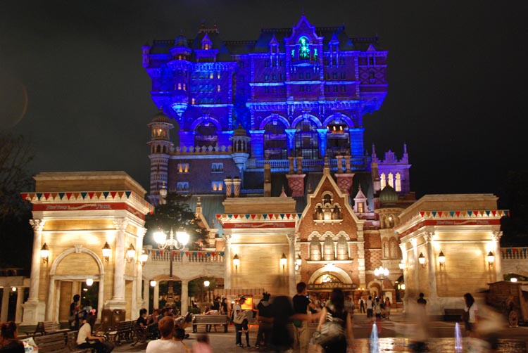
While I have not ridden Tokyo's not-officially-Twilight-Zone version yet, something of this color-based storytelling seems to have survived, albeit with yet another alteration.  Rather than being red/blue, the dichotomy is red/green.  As part of the nighttime effects, the red brick exterior gets illuminated by the lightning arcing from the cursed idol's green eyes-- the same green eyes which also curse the guests in the mirror and even receive special notice in the ride's narration!

(Note: the following Tokyo photos are screenshots from this video by Attractions Magazine)

Exterior
The Pre-Show
Hallway Scene
Mirror Scene


Of course, the Tower gets even spookier at night.  And what's the lighting scheme?  Either bright blue, or bright blue-purple, even in Tokyo!  Florida's sign even adds the extra touch of having that cool-green border around the letters of "Hollywood Tower", while Tokyo has the green glow from the idol in the top window.

DCA
Paris

Florida

Tokyo; photo from Theme Park Review


It's clear that much care went into designing the details of the Tower of Terror attractions.  Even though guests may not even notice it on the first few rides, the shifts in color fulfill a major role in telling the story and building the atmosphere.  This kind of attention to detail is essential to a complete themed attraction experience.

Sunday, December 16, 2018

Now on Twitter too!

I also am now on Twitter with the handle @HTH_fan_archive!  Admittedly I'm very new to how Twitter works at all but I hope all will go smoothly!

DCA Promotional Doorknob Hanger, 2004

Here's one of the original promotional items for the DCA Tower of Terror, scanned from my personal collection.  Created to promote the Tower's opening date, this was distributed to Annual Passholders.  I'm not sure if this was distributed to those who participated in AP previews, or if this was included with the passholder newsletter.


Wednesday, December 5, 2018

Photos of the 2004 Rose Parade Float!

While digging through some old family photos, I found quite a few treasures!  Among them were these photos of "A Sudden Drop in Pitch", Disney's record-holding, Tower of Terror themed Rose Parade float.  After the parade, Disney displayed the float at DCA, where these pictures were taken.

The float was really tall--it still holds the record for tallest Rose Parade float!


Basically everything depicted on the float in this picture is now gone from DCA.
The front of the float, with the title.

Monday, December 3, 2018

Not as bad as Mission Breakout, but still missing the mark: an Incredicoaster review (repost from Tumblr)

Note: This was originally posted to the Tumblr version of this blog on August 25th, 2018.  In light of Tumblr's potential upcoming purge of content, I am reposting it here for preservation.


Well, I finally got to try out Incredicoaster, the other “”””new”””” thrill ride DCA’s gotten, and thought I’d write out some opinions and observations.  I know I’m probably late to this, but hey, I was busy and my pass was blocked out.  I decided to break the review into sections to better organize it.
1. The Track 4/5
It’s still the same California Screamin’ track, so that’s all good!  I would give it 5/5, except the track is in surprisingly rough shape!  There were rusted looking spots and places where the paint had clearly long worn off, and the ride experience was generally rough, especially the loop.  I thought the track would feel better than ever due to it coming back from the long conversion refurb, but it was rougher than the last time I’d ridden it as Screamin’ (which was right before its closure for Incredicoaster conversion).
2. The Queue Area 2/5
To be fair, Screamin’ had a terrible unthemed queue too.  Incredicoaster sadly doesn’t really change that, aside from some artwork of the Incredibles and panels with descriptions of the characters.  What is worse, though, is that Screamin’s relatively shady umbrella-esque line covers have been replaced by white columns that, while aesthetically interesting and in the midcentury modern style, provide less shade than the old covers.  What the area always needed was more shade for the hot concrete queue, and the changes didn’t help.
3. The Soundtrack 1/5
This is probably the worst thing about the Incredicoaster.  Playing the Incredibles soundtrack over the coaster experience would probably be pretty good.  Instead, the music is mostly drowned out by constant voiceover lines from the Incredibles as they frantically search for Jack Jack in the tunnels.  The tunnel scenes are pretty self explanatory even at the high roller coaster speeds, so the voiceover feels really redundant.  Furthermore, at least on the train I rode, the volume on the voices was REALLY LOUD, so it was less “roller coaster with a plot” and more “super family screams in your ears as you ride a roller coaster”.  It’s not fun having a family, even a super one, scream in your ears for the entirety of a ride.
4. The Plot 2/5
A themed roller coaster doesn’t need much plot to work.  Rock n Roller Coaster does a great job with just “you’re going to a 1990s Aerosmith concert”.  Incredicoaster bites off more than necessary by having TWO plots.  The first, shown on screens in the upper queue area, is that the city is honoring the Incredibles by renaming a classic roller coaster after them.  Violet thinks they “deserve better than a re-theme”.  Yes, Disney gave the ride a meta-narrative about how disappointed THE CHARACTERS THEMSELVES are with the ride.  Somehow, the admission that Disney knows it did a sub-par job just makes the ride seem worse, rather than being funny.  It’s especially unnecessary given that the main plot of the ride, the one on the coaster itself, is entirely independent of the “award/disappointment” plot!
The plot of the coaster, as explained by brief scenes at the beginning of the ride, in the tunnels, and at the end of the ride, is that Jack Jack’s powers are going crazy again and the family is trying to catch him before he can wreak any more havoc.  It’s not a bad plot, maybe just the right amount to be told in its limited run time, although it’s probably more suited for a family friendly dark ride than a big looping coaster.  What makes this plot insufferable, however, is how Disney tried to use voiceover to fill in the time between the scenes; see “soundtrack” above.
Not really a category, but an important observation anyways:
What is the intended audience of this ride?  The Incredibles theme and kid-focused plot makes it seem like its focus is on a younger audience, but this is still the track of California Screamin’–a big, fast, looping coaster with one of the highest rider height requirements, initially aimed at older kids, teens, and up.  It’s not that kids can’t enjoy big thrill rides (I was one of those kids that rode every thrill ride the second I met the requirements), but the fact that the ride safety requirements exclude a significant percentage of the theme’s target audience makes it a weird fit.
Overall: 2.25/5
The most positive thing I can say about it is that the track is unchanged, and the track was generally the appeal of the coaster anyways (if your headphones could somehow drown out the shouting voiceover, you’d just need an mp3 of Screamin’s soundtrack to “convert” it back).  However, the unpleasant soundtrack, lack of effort in the queue, and the fact that the Incrediblesreally did deserve better than a quick re-theme make for an overall poor effort from Disney.  The fact that it’s so relatively easy to have the “classic” Screamin’ experience makes this a less offensive change than the Tower-Breakout conversion, but the fact that there’s two poorly done re-themes in a row marks an unfortunate trend in current Disney parks.

Wednesday, November 14, 2018

Happy (Late) Halloween!

Hey, sorry for being so quiet around here!  At any rate, I thought it'd be fun to share my pumpkins I carved for Halloween this year.  I decided to go with the theme of two of my favorite Disney rides.  First, of course, was the Tower of Terror (Florida version):

Unlit
With the candle inside


Unfortunately, this one rotted before Halloween.  This is how it looked about October 29th, only two days after carving:

Technically, I think this is a Mission Breakout jack o' lantern


Thankfully I was able to find another pumpkin last minute...and a rather large one at that!  It was a bit weirdly shaped, but luckily had one good side to carve.  And even though it's technically off-topic for here, I'm really proud of the result.  Here's Rock n' Roller Coaster!:


Freshly carved and unlit
With the candle inside

I'm really, really proud of how this one turned out.  There was a lot of fine detail to carve, and it was difficult finding a pumpkin large enough to fit the design on such short notice.  Also, thankfully, for some reason this pumpkin lasted much longer and I actually kept it displayed a few days into November.

If you're wondering how I did these, they're actually pretty easy to do.  All you need is a printed template of your planned design and one of those 5-tool carving kits you find at places like Walmart around Halloween (Pumpkin Masters being the most common brand I've seen).  These particular designs I've had for a while, and I think I downloaded them from one of Disney's own Oh My Disney posts about a year ago.  The best tips I can give are to be patient and give yourself enough time to carefully do the fine details.  Thoroughly scraping down the inside of the pumpkin with the scooper so that there are minimal "strings" left also makes carving a lot easier.

Also, yes, this is late, but HAPPY HALLOWEEN!

Tuesday, July 31, 2018

Alternate Tower Spotlight: The Florida Tower of Terror--The Boiler Room and Loading Areas

After viewing the pre-show, guests filed into the boiler room hallway.  Unlike the all-concrete walls of the DCA and Paris Towers, the walls here were brick framed by arches of concrete.  Also unlike the later incarnations, both libraries entered into the same hall, and the groups were not separated by any kind of fencing.  Across from the library openings was a faded stenciled sign on the bricks reading "Service Elevator" with an arrow pointing to the left.  Pipes ran along the walls, and a couple of covered electrical boxes were on the left side.

June 28, 2017


Near the end of the hallway, on a concrete column, a sign read:

Boiler Room -->
<-- Laundry
<-- Maintenance
Basement Level
<-- Exit

June 28, 2017

June 28, 2017

Indeed, looking back down the hall, there was an emergency exit in the direction indicated by the sign.

June 28, 2017


After walking through the open set of heavy-looking doors, guests found themselves in the boiler room proper.  Initially, one of the large boilers blocked their view into the main room.

June 28, 2017
The path to enter the boiler room, June 28, 2017


The boiler room in Florida looked completely different from its Parisian or Californian counterparts.  It differed in layout, decoration, color palette, and even background soundscape.

A very approximate, not to scale sketch of the layout of the Florida boiler room.  Unlike Paris and DCA, it had only one floor.

Unlike the blue-colored vaguely industrial aesthetic adopted by later Towers, the Florida boiler room's look was dominated by a distinctly brown-red palette (thanks to the brick) and also decorated with carts of fake coal.  The design of the machinery likewise looked older than the DCA/Paris machinery, underlining the fact that this Hollywood Tower was built around a decade earlier (in story) than the others and thus still contained the remnants of the steam age.

A screenshot from Attractions360's video, showing some steam machinery.  Note that their camera made the room look much brighter than it appeared in person.

The trash cans in the Florida boiler room were unique as well.  They were small, brown, pill-shaped canisters attached to the metal railing of the queue.

Another screenshot from Attractions360's video, showing the main path and one of the trash cans.


Florida Tower had the same vague mechanical humming sound as BGM that DCA/Paris used, but unlike those Towers that wasn't the only layer to the atmospheric soundscape.  Hissing sounds emanated from the machinery, once again making it absolutely clear that they were old steam boilers rather than just any industrial machinery.  There used to be fog machines to simulate the steam itself, but this effect had been long discontinued.

Florida also had thunder crash sound effects of varying intensity layered over its BGM.  While this continued to add spooky atmosphere and keep the threat of the storm fresh in guests minds, it also raised questions over how guests could hear thunder in the boiler room.  The lack of storm noises in the DCA/Paris boiler rooms emphasized that the guests were now deep in the buildings' basements and thus unable to hear the thunder.  This emphasis was especially important since the guests never actually walked down stairs and thus the story element of going to a lower level had to be conveyed through other means.  Therefore, Florida's sound effects implied either 1)their boiler room was not in the basement or 2) the storm was THAT intense to still be heard even deep below the building.  Depending on how one interprets that sign in the boiler room hallway, indicating "<-- Maintenance Basement Level", point #1 could actually be correct, as the sign might indicate that one must go the indicated direction to get to the basement.

Towards the middle of the boiler room the guest path forked, with one choice leading forward and the other toward the right.  It was up to guests to choose whether to take the forward or right paths, and if one choice got too full it could back up and block guests' ability to take the other route.  It is likely for this reason that the later Towers simply separated the loading lines from the libraries onward, rather than Florida's "choose your own adventure" route.

The fork in the road, June 28, 2017
Looking back towards the libraries from about the same spot as the previous photo.  June 28,2017


There were only four elevator loading sections at Florida's Tower, rather than the 6 from later versions.  The forward path went to the left two loading zones, and the right path went to the right side loading zones.  The forward path took guests past the mechanic's desk, which had the "It's easy enough to be pleasant" poem.  However, there was no spooky radio with ghostly voices; there was no spooky wall in this boiler room either.  While Florida's boiler room was arguably the most realistic rendition of a boiler room (coal visibly present, steam sounds, practical-looking machinery that never delved into the cartoony "horror" of DCA/Paris' face boiler), it also had the least to see in terms of Easter Eggs.

The mechanic's desk, June 28,2017.  Though now on a white card rather than a dark-colored plate, the poem still read, "It's easy enough to be pleasant/when life hums along like a song/ but the man worth while/is the man who can smile/when everything goes/dead wrong."
The radio on the all next to the mechanic's desk.  Unlike its DCA/Paris counterpart, it was completely silent and thus arguably not "spooky". July 2, 2017


The right side path had guests weaving slightly back towards the boiler room entrance on the way to the right side loading areas.  Unlike the left side path with its mechanic's desk, there wasn't really one distinct decorative feature that one could only view from this side.

View from near the end of the right path, right before going into the right loading area.  Note the cart of coal that confirms these are steam boilers. June 28, 2017

In between the two sets of elevators was one more "maintenance service elevator", generally dressed to look the same as the others.  However, it had a sign in front of it, stating "ELEVATOR SERVICE TO LOWER LOBBY".  The sign under its dial also notably read "express elevator" instead of "service elevator".  This was in fact the "chicken exit"/staff usage elevator, and was an actual functioning modern elevator meant to take guests or staff to the exit area of the ride.  The design not only blended in well so as not to break theming, but also probably offered one little scare for those unwilling to go for the big scares on the ride, as it would appear to the unobservant that they were being led to a loading area rather than an exit!  The sign conveniently provided a name for the exit/gift shop area as well.

The middle "chicken exit" elevator, as seen from the right side fork queue. Arguably, this clearer view of the chicken elevator was the right side path's "special view", with the left side getting the mechanic's desk. July 3, 2017
Safety warnings plaque from the boiler room.  One of these signs was posted on a brick column just before the loading area; I'm not sure if this photo is from the right or left fork.  July 3, 2017

The loading areas each had a generator between the two elevators.  While at DCA and Paris the generators sparked randomly, at Florida they were timed to give the illusion of actually powering the elevators.  They whirred to life, sparking and making loud noises, whenever one of the elevators arrived at or departed from the load station.

Overall view of one elevator's loading station, June 28, 2017
Loading area generator, July 2, 2017


Likewise, the dials above the elevators moved from 0 to "13" (past 12) as cars launched and then returned.  Unlike DCA/Paris, the needle never paused at any intermediate floor, presumably because of the different load/unload setup of Florida.

Elevator with the dial at 12.  July 3, 2017

Operator's control box in the loading area, July 3, 2017


Guests stood on brass number plates like those at other Towers, except these were connected in a line by a metal strip for unknown reasons.

Numbers on the floor, June 28, 2017


Furthermore, as indicated by the seating chart, the seat numbering was different on the Florida Tower.  The front row was rows 1 and 2, rather than rows 1 and 6 like DCA/Paris.

Seating chart, June 28,2017

While waiting for the elevator, the recorded safety spiels played.  These are the same as those played at DCA, and can be heard here (live recording from DCA).  I find it strange that DCA used these same spiels, but had a different safety spiel before the library.

Once the elevator dial returned to basement level, the doors opened and the loading cycle began.  Guests stepped right onto the elevator--no awkward dark hallways like at DCA!  This obviously made the elevator seem much more realistic.  The bellhops directed each row of guests to their seats, starting with the back row.

The elevator car looked the same as at DCA and Paris, but with one big exception: There was no graphic on the back wall!  Whereas the later Towers had "Maximum Load: 3 Tons, do not stack above this line" painted on the back wall of the vehicle, Florida Tower merely had "Maximum Load: 3 Tons" subtly painted in relatively small stenciled font near the top of the back wall.  It was very easy to miss and more like something you'd realistically see painted in a maintenance lift.

The safety check procedure also went the same as at other Towers; the bellhop cast member went row by row, starting in the back, making sure everyone's seat belts were fastened and making them tug on the yellow strap to ensure it was secure.  Once everyone was buckled up and the front gate was closed, they probably were supposed to deliver a themed spiel about ride safety before launching the ride.

I say probably, because during my entire Florida trip not a SINGLE loading bellhop even attempted any sort of themed spiel.

The most they did before launching the ride was a vague "Keep your hands and feet in the ride, and no flash photography please" basic line, usually done in a bored tone.  Thankfully, someone who was familiar with Florida's ride procedures gave me this example spiel:

"Welcome to the Hollywood Tower Hotel.  Since we have so many celebrities staying with us, we request that there please be no photography or videotaping while on board.  For your own safety, please remain seated, keeping your hands and arms inside the elevator.  Please keep a tight grip on all hats, cameras, and other personal belongings that you have... grown fond of.  Please, do enjoy your stay."

I feel the need to note that, as of 2017, photography and recording were NO LONGER BANNED on Florida Tower, provided no flash/video lighting was used.  Or, at least, that is how everyone acted.  None of the bellhops mentioned "no photography" in their sparse spiels, only "no flash photography".  Nobody made any announcements or otherwise objected when I or anyone else very obviously took photos or videos (without flash or lighting of course) either.

Thus, with the ding of a bell and possibly the obviously bored sigh of a bellhop, your trip on the original Tower of Terror began!