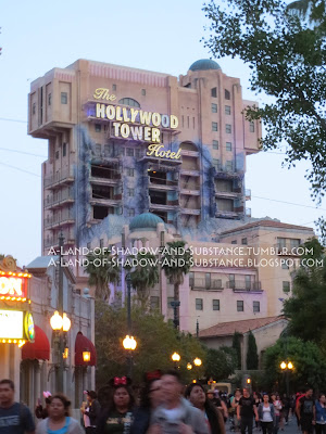
Settle in and get that Exterior/Lobby Loop playlist going, as this chapter’s got a lot to cover!
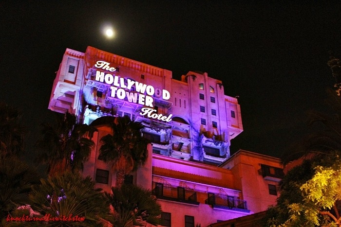
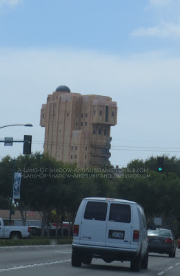
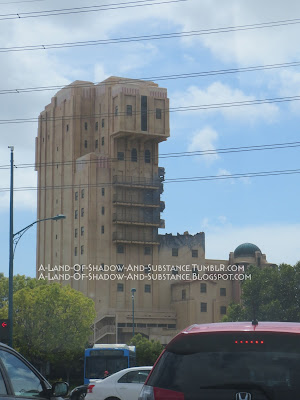
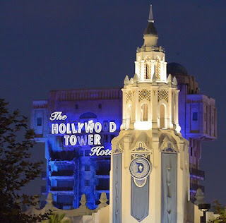
The setting of the DCA Tower of Terror ride was, of course, the Hollywood Tower Hotel. The hotel was a massive art deco building sporting some plot-relevant damage on its front side. The “damaged” sections opened to reveal the ride cars when they reached the top of the drop shaft.
 |
| May 2016 photo showing the left and center drop shafts with their doors open. Those two drop shafts were almost perfectly in sync that day; it was fun to watch. |
The three damaged sections represented the three parts of the hotel that were zapped into the Twilight Zone by supernatural lightning on the fateful night depicted in the pre-show video. There were still purple-ish burn scars from the lightning, and the sharp-eyed can spot the interior hallway paint and wood paneling on the “inner” parts of the damage. One could also see the remnants of broken windows in a side view of the damaged sections. The parts that opened were supposed to be the remaining elevator doors from the missing hotel parts. If one were facing the Tower, the left and middle drop shafts were right next to each other, while a stairwell (presumably for maintenance or emergency exit) separated the middle and right-most shafts.
Above the drop shafts was a large sign reading “The Hollywood Tower Hotel”. Some of the letters were off-kilter, presumably from the Twilight Zone disaster, and at night the sign flickered as if some of the lights in the letters were partially broken. According to MickeyAvenue.com, the “Hollywood Tower” portion of the sign was set in Franklin Gothic font (judging from font samples I believe that it was a bolded variant of this or a similar font), and the “The” and “Hotel” portions of the sign were set in Snell Roundhand font (which looks spot-on perfect).[1]
EDIT: As it turns out, the font for the "Hollywood Tower" portion might in fact be "TW Cen MT Condensed", a standard Windows font. It's almost identical to Franklin Gothic, except the "E" and "R" look closer to the actual sign's design than the Franklin Gothic sample below. Credit to audoman2607 for this information.
/EDIT
EDIT: Futura Condensed Extra Bold also looks nigh-identical to the "Hollywood Tower" portion of the sign, and is thus another contender for being the sign font. Thanks to Brendan Waters in the comments for this info! /EDIT
 |
| An
approximate re-creation of the hotel sign I cobbled together from Snell
Roundhand font and screenshots of samples of Franklin Gothic (which wasn't available for download). The “Hollywood
Tower” part looks a bit thinner than the real thing, leading me to suspect that
the font was bolded for the actual sign. |
Along the sides of the Tower were four balconies sticking out along the length of the building. Each balcony had two doors leading to it. The doors were painted to blend in very well with the wall of the building; I didn’t notice them until I started building a
paper model of the Tower and, upon noticing the doors on the model, looked at photos to see if they existed on the real building. I do not know what these doors accessed. Personally, I suspect they were maintenance access doors. TowerSecrets states that they accessed engine and computer rooms.[2]
Rather than simply get into an extended description of the specific ride appearance here, though, I’d also like to explain more about the architectural style of the DCA Tower of Terror (note that this applies to the Paris Tower as well).
The exact definition of art deco is surprisingly hard to pin down. Although the style was most popular in the 1920s-1940s, there was never a definitive end to the art deco era, as buildings are still constructed in this style today and indeed a lot of art deco elements blend well with other current trends. Generally, however, art deco involves geometric patterns (such as radial “sunburst” designs) often inspired by Egyptian or Central American artwork and industrial technology. In general, art deco was meant to celebrate and mimic technology, industry, and progress, while also drawing inspiration from the past.
Art deco encompasses a wide range of styles, ranging from simple and boxy to elaborate-but-stylized designs. The Tower of Terror included both of those aspects; its overall shape was a boxy T capped with round greenish blue domes (simulating weathered copper), but it had its share of stylized decorative flourishes. Notably, it had those stylized floral flourishes on the corners by the domes, and the geometric ribbing along the top edge of the building. The Paris version’s “round things” add to the decorative aspects of that Tower.
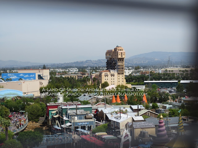
Hollywood loved art deco design. The style was opulent and futuristic yet dignified, and became a popular design choice for movie theaters as well as buildings within Hollywood itself. To this day one still sees quite a bit of art deco while driving around Hollywood and Los Angeles, and it’s still a popular choice for movie theater design. As such, it is not at all surprising that the fictional Hollywood Tower Hotel was depicted as art deco. Since Hollywood Pictures Backlot/Hollywood Land at DCA was made to represent Hollywood, it has also had its fair share of art deco from the beginning. The post-2012 “Buena Vista Street” version of DCA has even more, as the new façades were meant to reflect Los Angeles in the 1920s.[3] In fact, walking to the Tower of Terror provided a veritable parade of art deco architecture to guests.
The DCA (and Paris) versions of the Hollywood Tower Hotel were a specific type of art deco known as “pueblo deco”, which takes inspiration from Southwestern design. Such inspiration included flat-roofed adobe construction and Native American designs. TowerSecrets calls pueblo deco a hybrid of art deco and pueblo revival styles.[4]
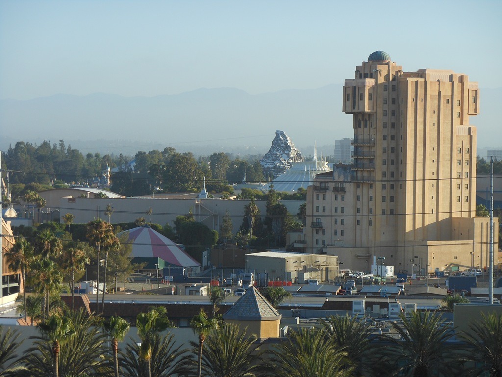
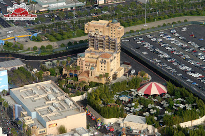
The rear side of the Tower was properly themed as well. The structure was one of the tallest in Anaheim, and was easily visible from outside the parks. Thus, the rear of the ride was disguised, not as Moroccan architecture like the Florida version, but as…a hotel. By using forced perspective and keeping all Twilight-Zone-related damage to the front side of the building, the designers were able to make the Hollywood Tower do a reasonable impression of an actual hotel when viewed from the rear. At one point, while driving toward Disneyland, my mom asked me “Hey, what’s that new hotel there? The tall, tan one? It looks nice." It was well-disguised enough that my mom didn't recognize it as the rear side to one of her favorite rides!
And now, for your viewing pleasure, the BACK! SIDE! OF! TOWER!
 |
| May 2016 photo. With the trees blocking the lower front part of the facade, it really does look like a hotel. |
 |
| An aerial photo showing more of the backstage areas behind the Tower, from the blog disneylandguru |
 |
| As you can see, the “real hotel” illusion does fall apart as you get closer and can see more of the sides and their Twilight Zone damage. |
 |
| For comparison, here's a picture of the back side of the Paris Tower, courtesy Mrbellcaptain. The backstage buildings are configured differently, given the different needs of that park. |
 |
| Oddly this screenshot of the Disney Parks app, taken by land-of-manors-and-beans from Tumblr, shows an accurate depiction of the back side of the Tower (with the exception of the domes being missing). This is the first time I can recall the back side of the Tower being depicted properly on park map art. This screenshot was also taken 14 January 2016, after the Tower had closed. |
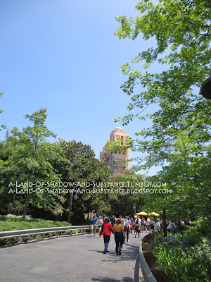
Speaking of unusual angles, here’s some more photos of the Tower exterior from various places throughout California Adventure:
 |
| May 2016 view from the Sun Wheel. My camera lens wasn’t quite able to get a shot through the safety grate without getting the metal bars in the picture. |
 |
| May 2016 view from the queue of Luigi's Rollicking Roadsters |
 |
| May 2016 view from the road between Car's Land and Bug's Land |
 |
| A lovely view of the Tower with the Carthay Circle Theater, showing how well the architectural styles went together. Photo courtesy land-of-manors-and-beans from Tumblr. |
 |
| Aerial view, by thethemeparkguy.com |
As you can probably guess, the Tower was visible from almost all of California Adventure. This still fit decently theme-wise in most lands, as it represented a Californian hotel. As for A Bug’s Land though, honestly I always found that to be one of the most amusingly clashing views in DCA. Oddly enough, I never took a picture of it myself, but they're pretty plentiful to find online.
Apparently, the view of the Tower from Condor Flats (redone as Grizzly Peak Airfield for DCA 2.0) was slightly controversial at one point. According to
[this] Yesterland.com entry, some people didn’t like that the Condor Flats “runway” originally had an unobstructed straight-line view of the Tower. They thought it suggested planes crashing into the building like 9/11! Of course, by 2012 the Carthay Circle restaurant blocked the “controversial” view, and the “runway” would be re-themed to a National Parks road (rather than an air strip) by 2015.
Enough dilly-dallying and admiring the building! Let’s get in line!
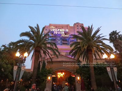 |
| A twilight view of the front entrance, May 2016. Curse those trolley wires for always getting in shots like this! |
One had two line options for the Tower of Terror. On the left side of the gate was standby, while the right side was fastpass. The lit-up signs were set in Bahnof Regular font, and the word “fastpass” was set in red and all-caps. On the cement columns holding each sign were flip-number clocks. The standby side indicated the estimated wait time in minutes, while the fastpass side indicated the current time, so that fastpass holders would know if their passes were valid. Oddly, I cannot recall ever seeing the standby side having its clock indicate a time lower than 13 minutes, even on un-crowded days where the ride was basically a walk-on. Of course, it’s possible this is merely coincidence (with me having never been there on a slow enough day for the time to be lower), but it would also fit theme-wise due to “13 is unlucky” being a common trope associated with “haunted” attractions. Alternately, given the length of the queue and the pre-show, it might be possible that simply the minimum time one might spend getting to the ride car was 13 minutes and thus the counter never had a practical reason to go to a lower time.
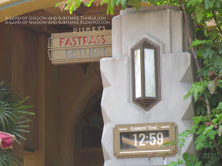 |
| Detail of the fastpass sign and flip-number clock, May 2016 |
The base sections of the cement entry columns also had brass-colored metal “HTH” logos embedded in them. These bases projected out from the main column, forming part of a planter border and edge to sit on.
 |
| Standby column with wait time, photo by Mrbellcaptain |
 |
| HTH logo on column base, photo by Mrbellcaptain |
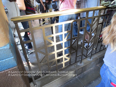
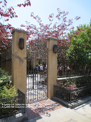
In between the two entrance columns was a bit of art deco fencing that separated the two entrances. The plaque containing the Tower’s safety warnings hung on this fence. While the Tower was operating, the two matching gates for the queues were open; when closed they formed a continuous gate with the center piece of fencing.
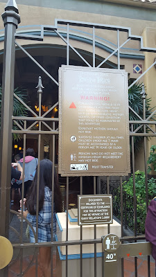 |
| Center gate safety warnings, photo by Mrbellcaptain |
Once past the gates, you entered a sort of open-air foyer. Ahead you saw the glass doors to the lobby, but you wouldn’t be going in quite yet. Tucked into the corners of the foyer opposite the lobby doors and closest to the entry columns were two large, square cement planters filled with some sort of fan-leafed tree-ish plant (I’m not familiar with plants, really).
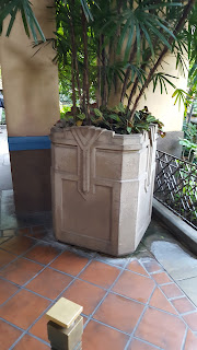 |
| Planter in corner, courtesy Mrbellcaptain |
The floor of the foyer was tile, and in the center was a mosaic of the HTH logo.
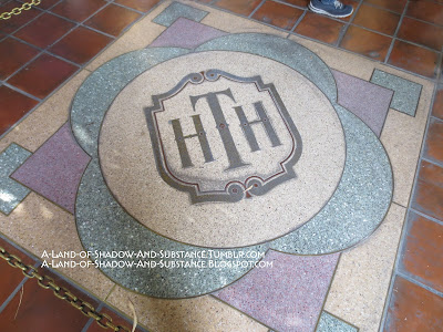 |
| May 2016 photo. Oddly, there seems to be some sort of scuff/wear marks towards the bottom of the HTH logo. This doesn’t make sense, as the mosaic logo was always chained off and people weren’t allowed to walk on it. Maybe that's water residue from where draining water pooled there and evaporated? |
The ceiling of the foyer had wood-paneled rectangles interspersed with faux-adobe “beams." A large chandelier hung in the center. Blue accent highlights and small tile decorations added to the space, while squares cut in the right and left walls of the recessed ceiling admitted additional light during the day.
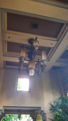 |
| Foyer ceiling; one can see the decorative tile pattern on the far right. Photo seems to have been taken while facing the fastpass garden. Courtesy Mrbellcaptain. |
Now, one’s guest experience diverged here depending on if one was fastpass or standby. Since the fastpass queue was naturally shorter, I’ll deal with that one first.
I was initially going to have to deal with the fastpass queue using only a few pictures snapped from the outside of it, but thankfully some readers sent in great photos that allow me to show the fastpass garden in detail! First of all, here is a general layout of the fastpass garden, sketched in about 30 seconds on MS Paint:
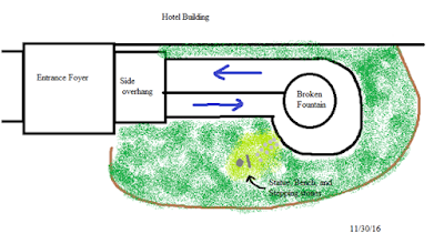 |
| Blue arrows indicate crowd flow |
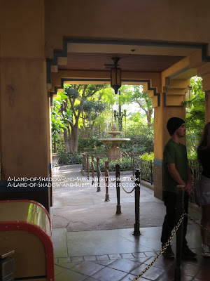
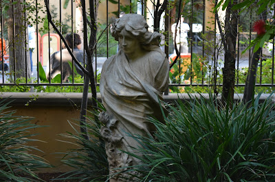
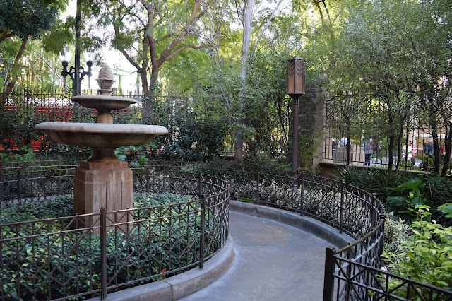
This was a small area, so there wasn’t too much to look at besides the plants that formed the garden. The centerpiece was obviously the broken fountain. Like the sign fountain from the front of the hotel, I’m convinced that this one never actually functioned as a fountain and was always meant to just provide spooky/abandoned atmosphere. The other thing of note in the fastpass garden was a small scene featuring a stone statue, a bench, and some stepping stones leading up to said bench, which I’ve indicated on my diagram. The statue in question was a grey stone bust on top of a grey stone column.
 |
| My only good photo of the fastpass garden, May 2016 |
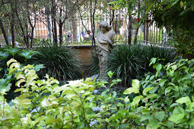 |
| Garden statue, December 2016 photo by Wandering Optimist of Micechat |
 |
| Garden statue detail, December 2016 photo by Wandering Optimist |
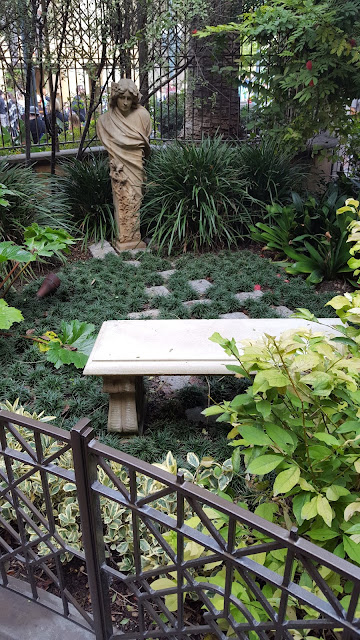 |
| Statue with bench and stepping stones, 2016 photo by Mrbellcaptain |
 |
| Broken fountain and "loop" at the end of this section of the queue. December 2016 photo by Wandering Optimist |
 |
| Just the fountain. 2016 pic by Mrbellcaptain |
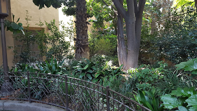 |
| Garden greenery, 2016 photo by Mrbellcaptain |
 |
| Looking back towards the foyer. 2016 photo by Mrbellcaptain |
I estimate the last time I saw inside the fastpass garden in person to be about 2007 at latest. Whenever I used fastpass in the years after, the line was fast-moving enough that I was just funneled straight into the fastpass side of the hotel doors, no wait in the garden necessary. I only remember the fastpass garden being used during the Tower’s early years, when 1) it was the new attraction everyone was clamoring to see and 2) DCA had fewer A-list rides to soak up the guests. I'm not sure if it got used again in the Tower's busy final months, but the reader photos sent to me sure make the garden look empty, which leads me to assume that going straight into the lobby was possible and thus the gardens were "optional".
EDIT: Wandering Optimist has clarified that the fastpass garden was indeed used at least a few times in the Tower's final months. On his last ride through, the fastpass line was looping through the garden, which prompted him to take the photos included here.
/EDIT
This side of the exterior queue had one more important thing: the hotel's official date plaque!
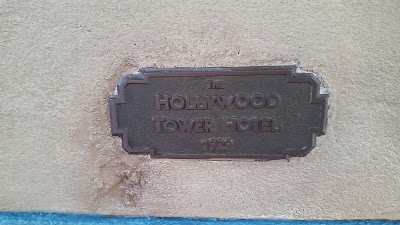 |
| 2016 photo by Mrbellcaptain |
This sign gave us the official canon founding year of the fictional DCA Hollywood Tower Hotel. Fun fact: 1929 is also the year that the real Hollywood Tower Hotel in Hollywood was founded. Florida's version of the fictional hotel was founded in a different year, specifically 1917. The sign's location was "on the wall, close to the door, on the way towards the small fastpass garden", according to Mrbellcaptain, who took the picture. The font for that plaque looks to be Banhof Regular.
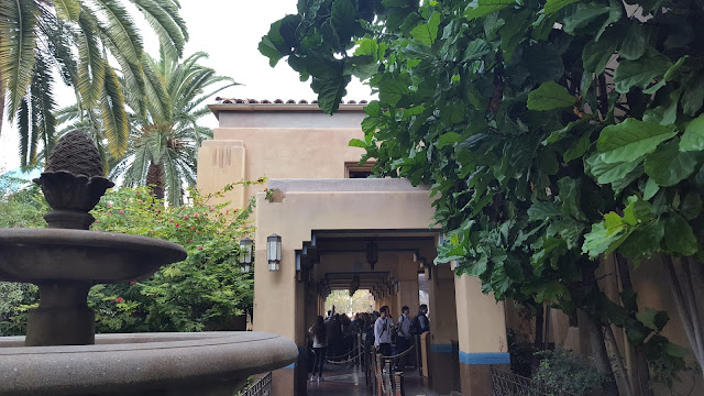
After going through the garden, one would enter the lobby doors. Before we continue into the lobby, however, let’s explore the standby queue.
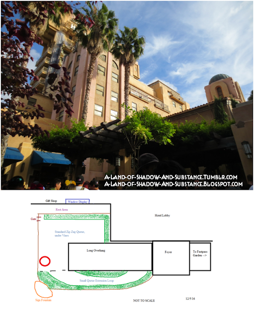
In all honesty, there wasn't too much much to see in the standby queue either. The exterior queue area was easily one of the weakest areas of the Tower of Terror in terms of enjoyable experience. The basic layout of the standby queue was this:
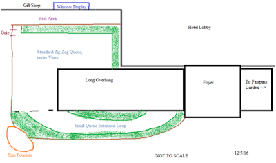 |
| Once again, this was done in about a minute in MS Paint when I realized that a diagram would help. As a result, it is rather out of scale. |
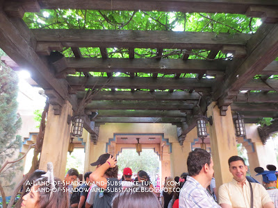
From the foyer, guests turned left and walked under an overhang. The overhang was like the one leading to the fastpass garden, but copied 3x to make a long overhang. Walking under the overhang, the front of the hotel and the start of one of the border planters was to the right, and an extension loop bordered by planters was to the left. A row of solid faux-adobe cutout-windows blocked the main overhang area from the extension loop; the opening and ending to the loop were closed by chains unless needed. The planters were filled with palm trees and greenery.
 |
| All the exterior queue was enclosed by this same art deco fencing. Photo by Mrbellcaptian |
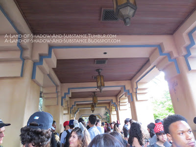 |
| Under the long overhang, May 2016. The view is from near the end of the overhang, looking back towards the foyer. |
 |
| Solid fencing for parts within the exterior queue. The majority of the zig-zags were separated with movable posts and chains. |
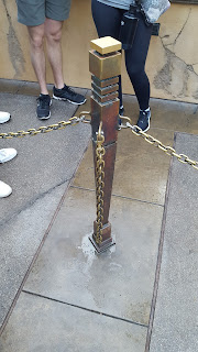 |
| Example of post with chains, December 2016 by Mrbellcaptain |
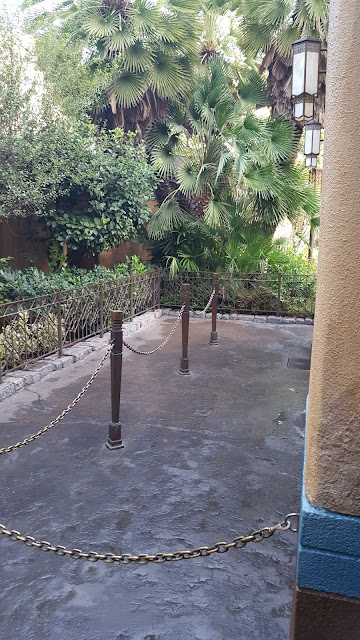 |
| The portion of the queue I labeled as "small queue extension loop" in my diagram. December 2016 photo by Mrbellcaptain |
There wasn’t really anything complex about the zig-zag main portion of the exterior queue. Guests zig-zagged under a canopy of vines. I’m not sure if these vines were real, artificial, or a combination of both.
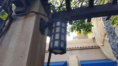 |
| Detail of a lighting fixture in the vines area. Look at the little dragon on it! December 2016 photo by Mrbellcaptain |
 |
| End of the overhang and the line zig-zagging under the vines in December 2016, by Mrbellcaptain |
 |
| A photo from under the vines, May 2016. In this picture, the viewer is looking straight ahead at the overhang. To the left is the planter with urns and the side of the hotel lobby. |
 |
| The gate at the upper- left corner of the zig-zag queue, the position of which I indicated on my not-to-scale sketch of the area. I took this picture while exiting from the gift shop area. I presume this gate was for emergency exit. Photo from May 2016. |
EDIT: According to Wandering Optimist, this gate was also temporarily used as the entrance to the Tower queue when the Red Car Trolley construction blocked the front.
/EDIT
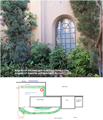
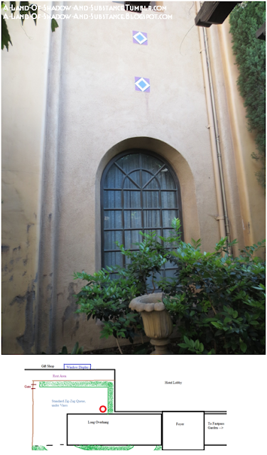
Along the edge of the zig-zag/vines area was a planter with urns that separated the queue from the rest area outside of the gift shop, and continued along the side of the hotel up to the foyer and lobby doors. The urns were grey stone or ceramic vases. Some of the urns were broken, presumably as part of the Twilight Zone incident. Also visible from this part of the queue, across from the rest area, was the gift shop "display window". Set into the side of the gift shop, it displayed a pretty dress and various vintage-style artwork and trinkets. There were "normal" and "Halloween" variants to this shop window. The Halloween version, for example, had a pumpkin-orange festive dress rather than the normal black and gold dress. I've also seen different photos showing slightly different arrangements of the things on display; presumably things got shuffled around once in a while, possibly in the transition from Halloween to non-Halloween form.
All following photos are dated May 2016. Circled section on "map" shows approximately where each photo was taken:
 |
| This shows the shop display window in "normal mode" as it looked in May 2016 |
 |
| This is an actual Lobby window! I believe it is the second one, with the dragon statue in front of it. |
 |
| Another real window! I think this is the first window, by the card game set in the lobby. Note the urn in the planter. |
After zig-zagging one's way around the queue, one would go back under the long overhang, walking back into the foyer.
Now that we're back in the foyer, let's go through those gorgeous art deco doors!
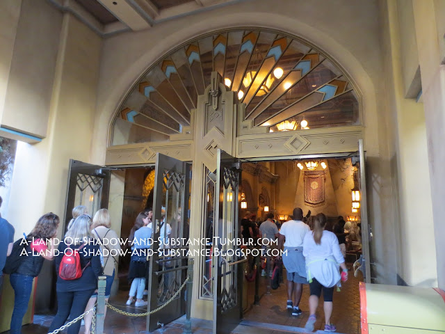 |
| Look at that gorgeous art deco "sun ray" design! The fastpass door is on the right, and the standby door on the left. Photo circa November-December 2014. |
**********
Actually, there's a little more to talk about concerning the exterior, specifically how it looked at night and how it looked as Disney began the exterior demolition in 2016. This post has gone on long enough, however, so those will be getting their own separate posts!