 |
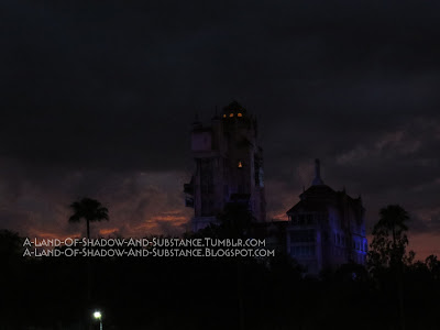
| Photo taken July 3, 2017 |
As of the time of this writing, no official announcements were made concerning the closure of the Florida Tower. In fact, a GOTG-themed attraction was officially confirmed for Epcot at D23. However, the conversion of the California version, and the probable similar fate of the Paris version (given that Disney Paris officially announced they were adding Marvel to their parks) were enough to make me (and likely other Tower fans) worry about the fate of the last Twilight Zone version of the ride. Thanks to an immense amount of luck, I was able to visit Walt Disney World during the last week of June and the first few days into July, and decided to take as many pictures and video as I could... you know, just in case.
Therefore, since I may as well share this information with my fellow fans, here begins my walkthrough of the original Twilight Zone Tower of Terror.
***
Note that this primarily covers the Tower as it appeared in June-July 2017. In its 23 years of existence, the Florida Tower went through a variety of upgrades and alterations, thus making a single "ideal" walkthrough for the entirety of the ride's history not really possible. Furthermore, not being from Florida, I was only able to visit Walt Disney World sporadically over the years, and thus can't say what previous versions of the ride were really like (I got to ride it as Tower 3/"Fear Every Drop" in 2002 as well as its Tower 4/"Never the Same Fear Twice" current version, if you're wondering which versions I did get to experience).
For a proper explanation about the history of its concept and the development of the ride, including explanations of the four different versions of this Tower, I highly suggest you watch Martin Smith's WDW Tower documentary.
Furthermore, despite the Tower remaining very much operational and in excellent shape at the time of this writing, I will continue to phrase my posts in the past tense for consistency.
***
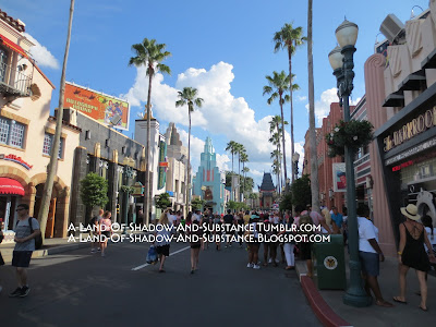
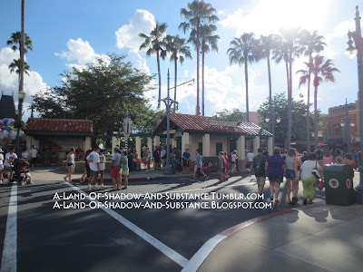
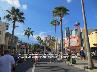
As guests entered Disney's Hollywood Studios (formerly Disney's MGM Studios), they found themselves plunged into the sharp art deco world of golden-age Hollywood.
 |
| June 2017 |
 |
| July 2017 |
 |
| July 2017 |
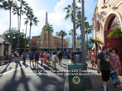 |
| Turning on to Sunset Boulevard. July 2017 |
 |
| July 2017 |
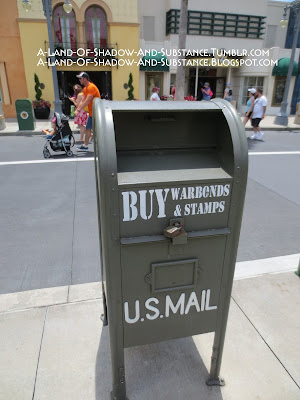
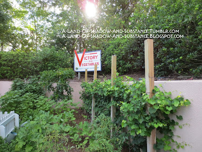
There was little doubt as to what era in which Sunset Boulevard took place. Every clue pointed to it being the 1940s, from the area music loop to the architecture to the vehicles and decorative display windows. Furthermore, fake mailboxes imploring people to buy war bonds and a victory garden by the food court section reinforced the setting.
 |
| June 2017 |
 |
| July 2017 |
True, it doesn't. I do have an explanation for Rock n' Roller Coaster, which I will address later. However, I feel very confident in placing Sunset Boulevard in the 1940s.
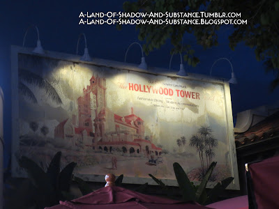
Sunset was a richly themed area that told the story of an expanding movie town coming into its own...and with a dark side everyone ignored. While gleaming art deco made up most of the street's architecture, its food court area still carried a more rustic agricultural theme, signaling the continuing growth of the city. Near the start of the street, an old billboard advertised the area's highly anticipated (both in and out of story) attraction: the Hollywood Tower Hotel.
 |
| July 2017 |
Our City's Newest Landmark
The Hollywood Tower Hotel
featuring
Fashionable Dining Modern Accommodations
"Where the stars stay and play"
The physical surface of the street itself provided a story as one walked closer to the Tower. Amid the bustling agricultural market and brilliantly expanding city, literal cracks appeared. Specifically, the road surface cracked to reveal under-layers of brick and old metal trolley tracks.
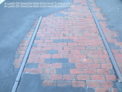 |
| Two photos of different worn-away sections in the road. These were actually taken as I was leaving the Tower, facing towards the entrance of the street. July 2017 |
Being a fan of Disney's California Adventure, I found the trolley tracks interesting for another reason; namely, that DCA added an actual working trolley that had a stop in front of its version of the Hollywood Tower Hotel. I can't help but wonder if the decision to include a trolley stop at the DCA Tower was some sort of homage to this original version, and if so what implication the working trolley had, given the story told by Florida's abandoned tracks.
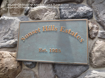
At the end of the street near the cracking pavement, on the corner by the food court, there was another little Easter egg: a construction stamp in the concrete reading "Mortimer & Co. 1928." This is likely a reference to Mickey Mouse's original planned name being Mortimer, and Steamboat Willie premiering in 1928. This didn't necessarily have anything to do with The Twilight Zone or the Tower, but it was a nice little detail that added depth to Sunset Boulevard and rewarded guests who take time to enjoy its carefully crafted atmosphere. Details like this showed the care and planning that had gone into this area.
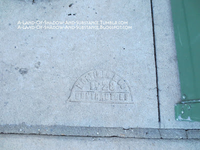 |
| July 2017 |
Now, I argued that all evidence points to Sunset Boulevard taking place in the 1940s. Of course, Rock n' Roller Coaster (henceforth "Rockin'" for short) clearly did not take place in the 40s... indeed, given the styling, attitude, and the appearances of the members of Aerosmith, Rockin' could only take place in the era in which it was designed and constructed: the late 1990s.
Rockin' was not an original part of the Sunset Boulevard area; the land opened alongside the Tower of Terror in 1994, while Rockin' opened in 1999. Indeed, the roller coaster ignored the crafted atmosphere of the land and instead went for its own tone, centering around a "hip", "edgy" 1990s-ish attitude, famous faces, and lots of music. As much as I loathe to say this about one of my favorite roller coasters, I can't deny that its tone and place in the land are not unlike, well...
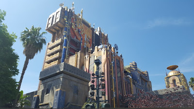 |
| ...yeah. (photo by Mrbellcaptain) |
 |
| July 2017 |
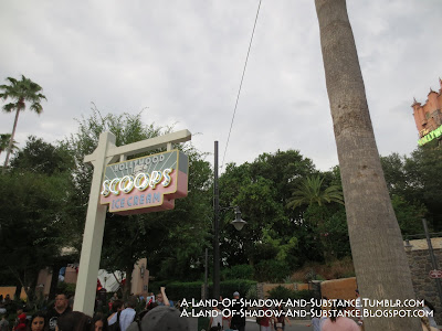 |
| Barely a peek at Rockin while turning around the corner by the food court, July 2017 |
Yes, I just used "subtlety and grace" to describe an attraction that features Steven Tyler in a giant hat and has a building-sized Fender Stratocaster on its facade.
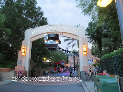 |
| A portal to the 1990s, July 2017 |
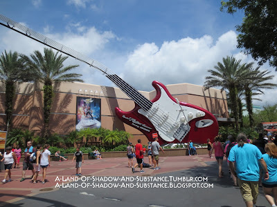 |
| June 2017 |
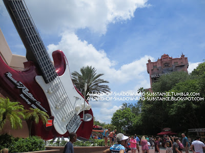 |
| Two of my favorite rides ever, June 2017 |
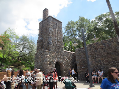
The start of the Tower grounds proper was marked by two stone buildings that looked almost like they would mark the entrance to a castle.
 |
| Entry gates to the Tower grounds. Note the trolley tracks in the cracked pavement. June 2017. |
The shorter stone building on the left (as one faced the Tower) was themed as a gardener's shed, having gardening tool props along one of its walls. In reality, it served as an electronic fastpass kiosk where guests could add fastpasses to their wristbands or cards. Before Disney implemented electronic fastpasses, the physical paper ticket dispensers were in this shed. Unlike California and Paris, the fastpass machines were not themed to luggage; instead they were sort of rusty metal boxes. The current kiosks seemed to be just standard electronic touch screen setups.
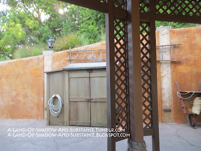 |
| Due to this area being crowded because of the fastpass screens, I couldn't get a good shot of all the tools. This one, which just shows the ladder and wheelbarrow, will have to do. July 2017 |
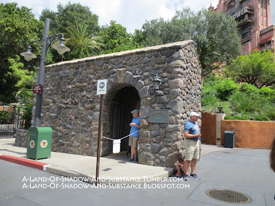 |
| A closer view of the left building. June 2017 |
 |
| June 2017 |
The right side building was taller and had a cutout in the top similar to arrow turret windows from old castles. Tucked in the front of this building was a set of restrooms.
 |
| June 2017 |
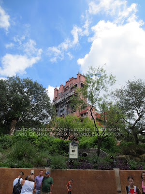
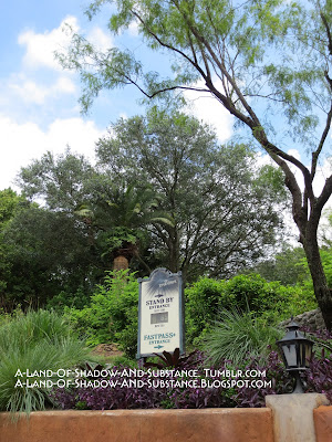
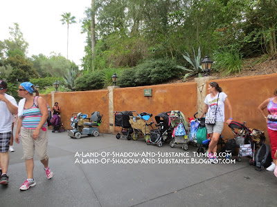
Much like the archway to Rock n' Roller Coaster, stepping through the portal formed by these buildings marked a distinct change in theme. At this point, the bright, modern art deco aesthetic of the growing city disappeared. From this point on, the design was almost entirely in an older gothic style, and the atmosphere was no longer a cheerful bustling town but creepy and overgrown with, as the Ghost Host might say, "an aura of foreboding." The wall and tall planter at the entrance to the grounds forced guests to look upwards at the Tower, giving it an imposing feel. Indeed, the effect was almost like having some sort of creepy castle on a hill, overlooking the oblivious town below.
To emphasize the separation, the background music changed from the Sunset Boulevard loop to the ghostly Exterior/Lobby loop that this attraction shared with its Californian and French counterparts.
 |
| June 2017 |
 |
| June 2017 |
 |
| June 2017 |
 |
| July 2017 (Click to enlarge to see sign) |
In general, Florida's Tower and grounds had a distinctly gothic design to them that sharply divided the dead hotel from the living, distinctly art deco city. The gothic styling also brought to mind old castles, or perhaps old buildings in general, especially haunted ones (see also: Walt Disney World's facade for the Haunted Mansion), while art deco was vibrant, new, and evoked a more modern feel. The different architecture of these areas suggested a timeline for the story.
At this point, the path split. Ahead, guests could go straight into the gift shop courtyard--a convenient shortcut for party members who didn't wish to ride the attraction. To the left, however, stood the entry gates to the Hollywood Tower Hotel.
 |
| June 2017 |
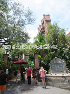
First of all, the "Hollywood Tower Hotel" sign that sat atop a fountain at DCA and Paris sat atop a planter-like structure full of rocks on the right side of the entryway. Compared to the grand fountain setup at California Adventure, this setup seemed a lot smaller. The height of the structure it sat on meant that people often sat on and obscured the sign. The sign was set into an almost tombstone-like structure, with the HTH crest above the sign. Of course, like the other versions of the sign, lights would twinkle and eventually illuminate the words "The Twilight Zone Tower of Terror."
Here's a video of the sign in action, taken by me. (Link is to Google Drive, since Blogger said the file was too large to embed)
Second was the gates themselves. They were large black iron gates that opened down the middle. There were spikes along the top, and at the top of the arch was the HTH crest. Notably, Florida used a unique version of the HTH symbol. The Florida version had "HTH" set in a shield flanked by two dragons and with a crown on top of it, while the California/Paris version used just the "HTH" set in the shield. The different versions of the crest suited the different architectural designs.
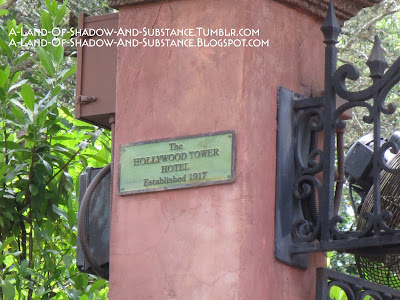
The third notable detail about the gates were two plaques set high on the two columns that bordered the gates. These plaques read "The Hollywood Tower Hotel established 1917." This dated the Florida version of the hotel as being twelve years older (in-story) than both the DCA/Paris hotel and the actual Hollywood Tower Hotel that lent its name to the ride. This age difference was reinforced by giving the two different versions different architecture.
 |
| June 2017 |
The hotel being established in 1917 added another layer to the timeline of Sunset Boulevard's story...and also caused a continuity error with that billboard at the start of the street. The concrete stamp and the Sunset Hills sign both gave dates of 1928 for major construction in the "city" section of the land, meaning they were newer than the hotel. This contributed to the street and Tower feeling almost like an adaptation of an "old haunted castle looming over a hopeful new town" fairytale-type setting. However, that billboard called the hotel the city's newest attraction, directly contradicting the other dates in the area. I don't have a way to explain that, other than development error.
The gate had two halves for entry: left for standby, right for fastpass. A warning sign listing a description of the ride and relevant health warnings stood in between the two entries. To the right of the fastpass entry, in front of the right side entry column, was a podium with an HTH logo where a bellhop cast member stood in case anyone had trouble with their fastpasses. Two electronic fastpass scanning stations stood on either side of the fastpass entryway, and guests had to touch either their wristband or entry ticket to the station before entering.
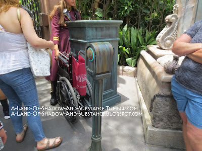 |
| Fastpass touch point, with cast member podium behind it. June 2017. |
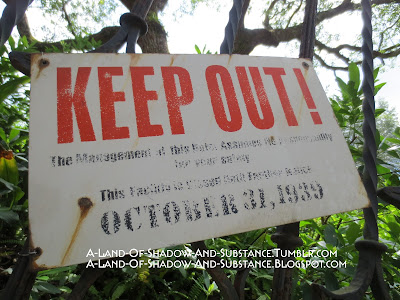
On the standby side of the gates (on the part of the gate itself that opened) was yet another significant sign.
 |
| June 2017 |
KEEP OUT!
The Management at this Hotel Assumes No Responsibility for your safety!
This Facility is Closed until Further Notice
October 31, 1939
The black text on the sign was extremely weathered, nearly to the point of illegibility. The date, however, was clear enough to read, and provided a date for the setting of the Tower's events. This date sign was much more obvious for guests than the subtle newspaper date that DCA and Paris provided.
Naturally, regardless of which side of the queue they used, guests ignored the sign, and made their way into the hotel gardens.

No comments:
Post a Comment