The exterior queue layout at the Paris Tower was the same as DCA. Upon entering the gates, guests found themselves in an open-air foyer with a chandelier and an HTH mosaic in the center of the floor.
 |
| April 2017 photo by Pyrokenesis |
Paris had more permanent fencing protecting the HTH mosaic, while DCA simply used some posts with a single draping chain around the design. In addition, although I do not have any clear photos of the corners, I also think that Paris lacked the extra planters with fan-leafed plants in the entry corners of the foyer. This omission could be due to the different landscaping needs of the Paris location, which I discussed in
part 1 of my Paris Tower coverage.
 |
| Foyer ceiling and chandelier, April 2017, Pyrokenesis |
Other than the more substantial fencing around the mosaic and the lack of planters, the California and Paris foyers were the same.
Like DCA, the Paris Tower had an exterior fastpass garden queue to the right and a standby garden queue to the left. Unfortunately, I don't have any photos from within the fastpass garden, but I do have photos taken through the fence from the outside which confirm that Paris had the same female statue in this part of the queue as DCA.
 |
| Unlike California, she didn't have a bench in front of her. April 2017, Pyrokenesis |
Pyrokenesis also confirmed that the "pool" directional sign was in the Paris fastpass garden, but was unable to get a photo of it.
 |
| Paris' date plaque, presumably in the same location as California's date plaque. Note the different landscaping. April 2017, Pyrokenesis |
As for the standby queue, it followed the same layout as its DCA counterpart, with one notable difference: there were no vines! Aside from the long overhang at the start of the exterior queue, the Paris standby exterior queue was open-air, without the wood scaffolding and vines that shaded DCA's.
 |
| Under the long overhang, April 2017, Pyrokenesis |
 |
| Broken urn in the border planter, April 2017, Pyrokenesis |
 |
| Looking at the queue switchbacks from the end of the overhang. April 2017, Pyrokenesis |
 |
| Another vine-less view, April 2017, Pyrokenesis |
I suspect that this change to the exterior queue was also due to the weather differences between Anaheim and Paris. In California, the vines and wood scaffold provided much-needed shade from the sun, while in Paris such a structure might get bogged down with snow in the winter.
Having gone through either the fastpass or standby sections of the exterior queue, guests proceeded through the glass doors into the lobby.
 |
| Looking out the entry doors from within the lobby. The fact that I don't see any planters in the background of the picture is why I think Paris' foyer didn't have them. April 2017, Pyrokenesis |
The lobby doors were the same as California's, with the exception of having green European-style exit signs above them. The
ghostly exterior/lobby music loop echoed through the room.
The ceiling featured a geometric tile design crossed with beams, with speakers for the background music hidden among the tiles.
 |
| April 2017, Pyrokenesis |
As far as I can tell, the ceiling and chandeliers were the same as the DCA Tower, albeit slightly less dusty. Notably, this wasn't always the case; California's lobby got a dustier, more web-covered treatment around 2010, while Paris retained the original look.
Although the Paris lobby had the same setup and scenes as its Anaheim counterpart, a variety of details differentiated them from each other. Indeed, once one notices the differences, it is surprisingly easy to determine which Tower a photo depicts.
The first scene on the left as guests entered was an abandoned card game, set up as if the players had suddenly vanished.
 |
| April 2017, Pyrokenesis |
For those curious, here is my May 2016 photo of the equivalent scene in DCA:
 |
| DCA Tower |
As you can see, Paris had a different, more wildly patterned carpet, different chairs, a different lamp and glasses on the table, and different curtains. Paris also had an additional painting above the dusty potted plant.
 |
| Detail of Paris' table. April 2017, Pyrokenesis |
 |
| Another view of the card game scene, April 2017, Pyrokenesis |
It also appears that Paris lacked the champagne bottle prop in this scene.
Beyond the card game was a decorative table set up in front of the next window, with a dragon statue and two lamps on it.
 |
| April 2017, Pyrokenesis |
Once again, the carpet and curtains differed from DCA. Although the setup of having a dragon statue and two lamps was the same,
which dragon statue and
which lamps differed between the two versions of the attraction. For those curious, here's California's:
 |
| DCA Tower, May 2016 |
Regarding those curtains, the geometric pattern on the top part of the curtain was also unique to each Tower.
 |
| Lower photo by Pyrokenesis, upper photo by Mrbellcaptain |
After the table with the dragon was the tea table scene. This was set up as if two people were enjoying some tea while writing letters before disappearing. A black sweater was still draped over the chairs, tea equipment remained on a serving tray nearby, and dusty envelopes lay on the table. One of the lobby's emergency exits was just beyond this scene.
 |
| April 2017, Pyrokenesis |
Zooming in on this picture, it appears that Paris lacked the bizarre half-written postcard that DCA had. This unusual Easter egg, consisting of a postcard that stopped half-written because the writer disappeared, would only have been visible to guests if they had to use the emergency exit. It makes sense that Paris would omit this strange detail, as it would never have been part of the normal guest experience.
The postcard was far from the only difference in this scene between Paris and DCA. Although the general description of the scene was the same, they featured different tables, chairs, carpets, curtains, and table setups. Paris also had a flower vase on the table, and another vase next to the emergency exit. Here's my (unfortunately blurry) photo of the sparser Californian version for comparison:
 |
| DCA Tower, May 2016 |
Following the tea set scene, guests encountered the main scene of the lobby: the main sitting area and grand fireplace.
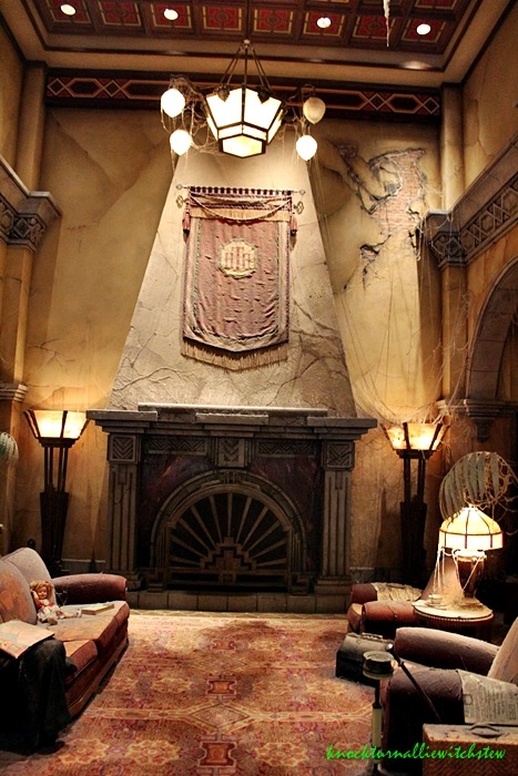
This scene consisted of the grand art deco fireplace along the back wall, with an HTH banner above it and a cracked, crumbling wall behind it, as well as a fancy couch on the left and two matching chairs on the right. In front of the whole scene was a carved owl statue set among dead plants. Everything was covered in dust and cobwebs... although not quite so many cobwebs as its Californian counterpart.
 |
| April 2017, Pyrokenesis |
 |
| The owl statue. April 2017, Pyrokenesis |
That owl statue, by the way, has been identified as "Great Horned Owl" by French sculptor Jules Moigniez. (Thanks to Mrbellcaptain for identifying it!)
On the left side of the sitting area, on the couch, was a creepy abandoned doll and a book. The doll may or may not have been a reference to the
Twilight Zone episode "Living Doll." On the right side of the sitting area, draped over one of the chairs, was the October 31, 1939 edition of
The Los Angeles Examiner, which thus provided the ride's story date.
 |
| April 2017, Pyrokenesis |
For those of you wondering how this differed from DCA, it was very much the same case as the tea set scene: The text description was the same, but the details differed greatly. One of the most notable differences was the color scheme of the carpet and couches. Paris' color scheme here was primarily blue-green, with blue floral patterned couches/chairs and a wildly patterned carpet that contained many blue and green hues. By contrast, DCA's color scheme tended toward red, having red floral patterned upholstery and a red carpet with a more subdued pattern.
 |
| DCA (albeit with its owl statue missing) for comparison. October 2016 photo by knocturnalliewitchstew |
Comparing the Paris and DCA photos, one can also tell that Paris' fireplace wall had a much larger chunk of plaster missing from its upper-right corner. The Paris couches were also less cluttered and dusty than the DCA versions as well. For comparison:
 |
| DCA Tower, May 2016 |
The banners above the fireplace also differed in design. Comparing the photos above, one can tell that DCA's was much more faded than Paris', that they had different tassels along the sides, and that DCA's HTH logo was smaller and higher up on the banner than Paris'.
Here's another interesting view of the Paris main sitting area, from
inside the scene:
 |
| I think this is a Disney stock photo |
Continuing clockwise from the sitting area, guests encountered the check-in desk.
 |
| April 2017, Pyrokenesis |
This dusty carved desk was still littered with the hat, coat, and umbrella of the person checking in when the lightning struck. The lamps on either side of the desk had HTH logos on the lampshades, and the sign read
Guest Registration
Cashier
Information
in Banhof Regular font.
The clock behind the desk read 8:05, because 8+5=13, and the Tower imagineers seemed to be trying to reference the "13 is an unlucky number" trope whenever they could. Oddly, according to this photo, the Paris Tower lacked the "13 diamond rating" plaque on the wall behind the desk.
Overall, this scene differed very little from the version at DCA. The only differences I could spot were the plaque, exact prop placement, dust levels, and the glimpses of the different queen paintings visible behind the desk.
 |
| Here's the inevitable DCA picture for comparison purposes. May 2016 |
At this point, a cast member sorted guests into the pre-show waiting areas. The CM did so while standing at the cast member podium next to the check-in desk.
 |
| A cast member directing guests. April 2017, Pyrokenesis |
The podium was identical to DCA's with the exception of the design on the lamp. DCA used the same Egyptian-patterned lamp both on the podium and in the libraries, while Paris' podium lamp had a simpler orange and green cover.
***
I had initially planned to cover the lobby entirely in one post, but this one was getting incredibly long already. Therefore, the next post will begin with the coverage of the lobby elevators and waiting areas!


It's very interesting to see the differences in designs between the two versions, Nice post!
ReplyDeleteThank you! It's really been fun comparing the two designs. I'm glad you enjoyed the post
Delete